2.1 Introduction
A new method for organizing and visualizing temporal data, collected at sub-daily intervals, into a calendar layout is developed. The format is created using modular arithmetic, giving a restructuring of the data that can then be integrated into a data pipeline. The core component of the pipeline is to visualize the resulting data using the grammar of graphics (Wilkinson 2005; Wickham 2009), as used in ggplot2 (H. Wickham, Chang, et al. 2019), where plots are defined as a functional mapping from variables in the data to graphical elements. The data restructuring approach is consistent with the tidy data principles available in the tidyverse suite of tools (Wickham 2017). The methods are implemented in a new R package called sugrrants (Wang, Cook, and Hyndman 2019b).
The purpose of the calendar-based visualization is to provide insights into human activities, especially relative to events such as work days, weekends, holidays, and special events. This work was originally motivated by studying foot traffic in the city of Melbourne, Australia (City of Melbourne 2017). There are many sensors installed across the inner-city area, that count pedestrians every hour (Figure 2.1). Data from 43 sensors in 2016 is analyzed here. This data can shed light on people’s daily rhythms, and assist the city administration and local businesses with event planning and operational management. Patterns relative to special events (such as public holidays and recurring cultural/sporting events) would be worth studying in comparison to regular days, but conventional displays of time series data may bury this detail.
A routine examination of the data would involve constructing a time series plot to examine the temporal patterns. The faceted plots in Figure 2.2 give an overall picture of the foot traffic at three different sensors in 2016. Further faceting by day of the week (Figure 2.3) provides a better view of the daily and sub-daily (hourly) pedestrian patterns. Flagstaff Station has a strong commuter pattern, with peaks in the morning and evening, and no pedestrians on the weekend. Around the State Library there are pedestrians walking around during the day, and an unusually large number on one Saturday night and Sunday morning. Birrarung Marr has a varied pedestrian pattern, with very different numbers of people on different days and times.
Faceting, initially called trellis displays (Becker, Cleveland, and Shyu 1996), is an example of a small multiple (Tufte 1983), where different subsets of the same data are displayed across one or more conditioning variables. It allows the comparison of subsets. Faceting can also be thought of as a simple ensemble graphic (Unwin and Valero-Mora 2018). It is a homogeneous collection of plots, whereas the ensemble graphics broadly organize related plots for a data set together into one display.
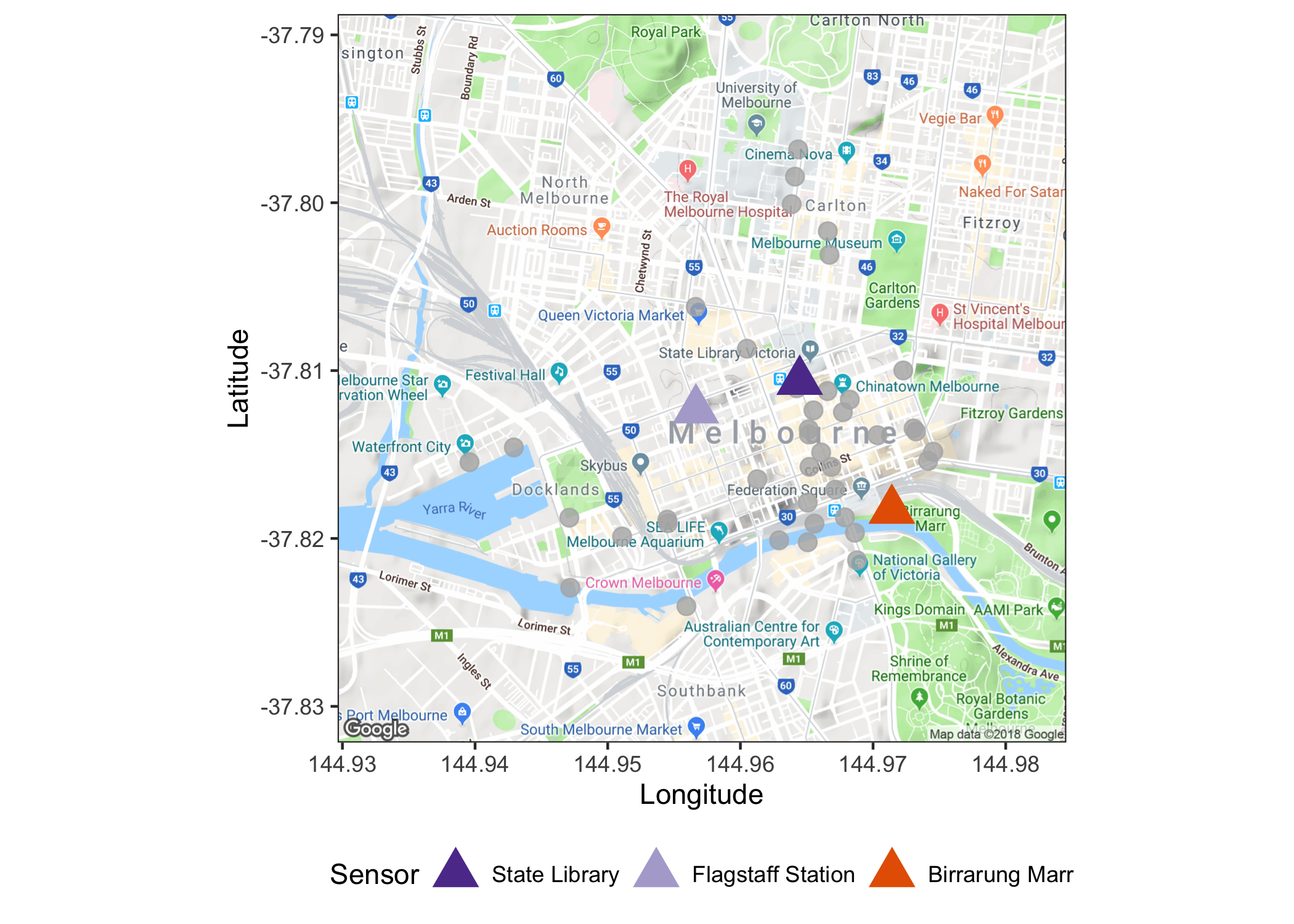
Figure 2.1: Google map of the Melbourne city area, gray dots indicate sensor locations. The three locations highlighted will be analyzed in the paper: the State Library is a public library; Flagstaff Station is a train station, closed on non-work days; Birrarung Marr is an outdoor park hosting many cultural and sports events.
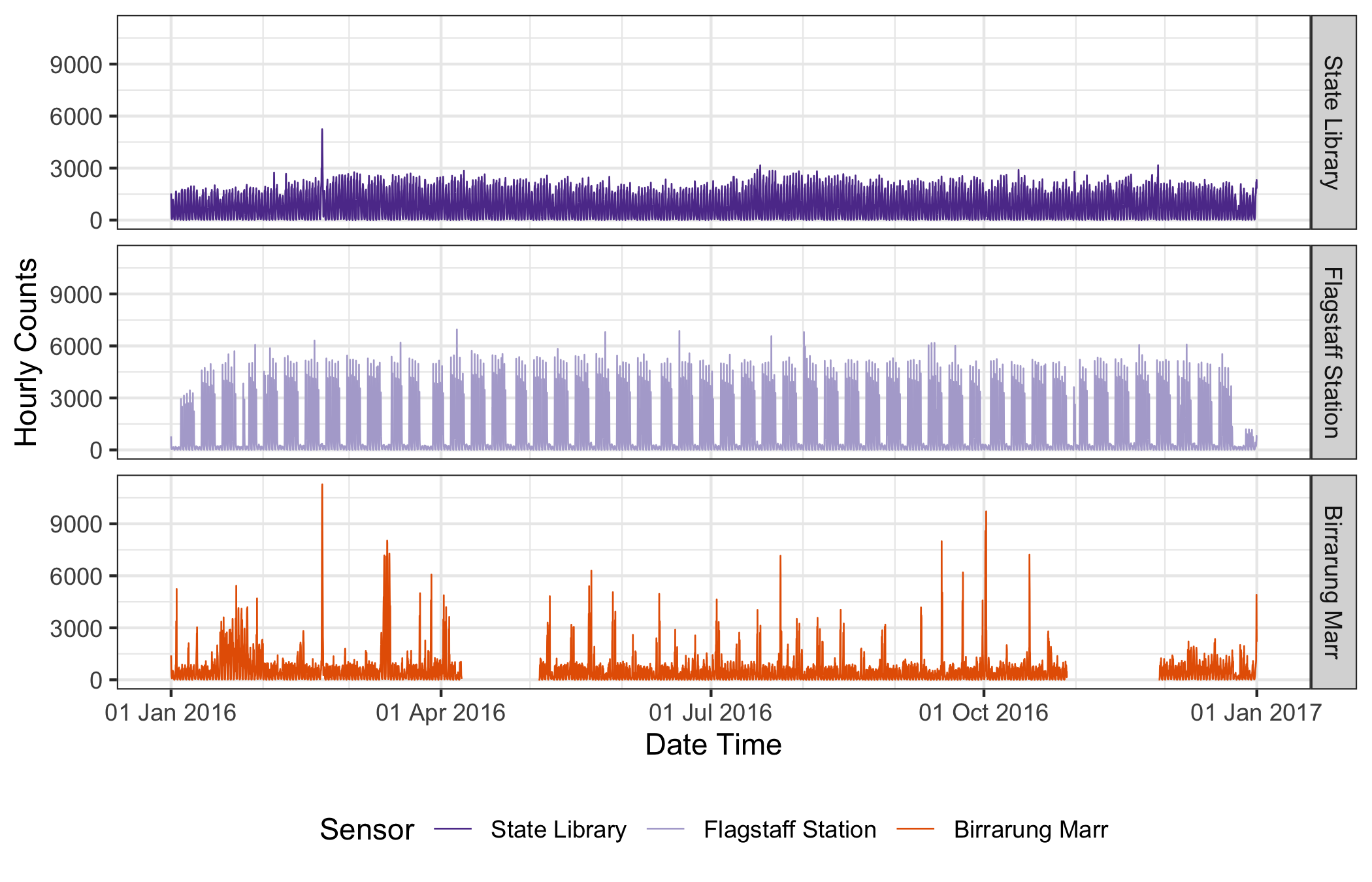
Figure 2.2: Time series plots showing 2016 pedestrian counts, measured by three different sensors in the city of Melbourne. Small multiples of lines show that the foot traffic varies at one location to another. The spike in counts at the State Library corresponds to the timing of the event “White Night”, where there were many people taking part in activities in the city throughout the night. A relatively persistent pattern repeats from one week to another at Flagstaff Station. Birrarung Marr looks rather noisy and spiky, with several runs of missing records.
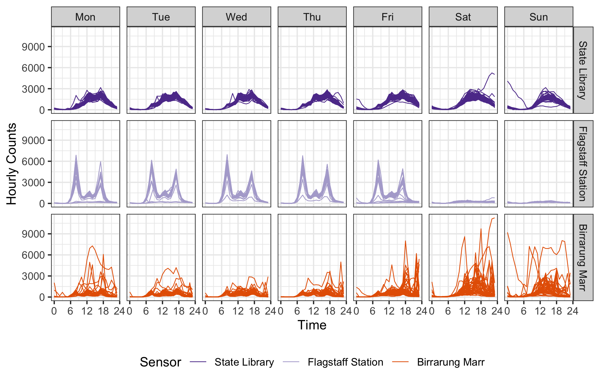
Figure 2.3: Hourly pedestrian counts for 2016, faceted by sensors, and days of the week. The focus is on time of day and day of week across the sensors. Daily commuter patterns at Flagstaff Station, the variability of the foot traffic at Birrarung Marr, and the consistent pedestrian behavior at the State Library, can be seen.
The work is inspired by Wickham et al. (2012), which uses modular arithmetic to display spatio-temporal data as glyphs on maps. It is also related to recent work by Hafen (2019) which provides methods in the geofacet R package to arrange data plots into a grid, while preserving the geographical position. Both of these show data in a spatial context.
In contrast, calendar-based graphics unpack the temporal variable, at different resolutions, to digest multiple seasonalities and special events. There are some existing works in this area. For example, Van Wijk and Van Selow (1999) developed a calendar view of the heatmap to represent the number of employees in the work place over a year, where colors indicate different clusters derived from the days. It contrasts weekdays and weekends, highlights public holidays, and presents other known seasonal variation such as school vacations, all of which have influence over the turn-outs in the office. Some variants of calendar-based heatmaps have been implemented in R packages: TimeProjection (Wong 2013), ggTimeSeries (Kothari and Ather 2016), and ggcal (Jacobs 2017). However, these techniques are limited to color-encoding graphics and are unable to use time scales smaller than a day. Time of day, which serves as one of the most important aspects in explaining substantial variations arising from the pedestrian sensor data, will be neglected through daily aggregation. Color-encoding is also low on the hierarchy of optimal variable mapping (Cleveland and McGill 1984; Lam, Munzner, and Kincaid 2007).
The proposed algorithm goes beyond the calendar-based heatmap. The approach is developed with three conditions in mind: (1) to display time-of-day variation in addition to longer temporal components such as day-of-week and day-of-year; (2) to incorporate lines and other types of glyphs into the graphical toolkit for the calendar layout; (3) to accentuate unusual patterns, such as those related to special events, for viewers. The proposed algorithm has been implemented in the frame_calendar() and facet_calendar() functions in the sugrrants package using R.
The remainder of the paper is organized as follows. Section 2.2 details the construction of the calendar layout in depth. It describes the algorithms of data transformation (Section 2.2.1), the available options (Section 2.2.2), variations of its usage (Section 2.2.3), including the full faceting extension equipped with formal labels and axes (Section 2.2.3.5). An analysis of half-hourly household energy consumption, using the calendar display, is illustrated in a case study in Section 2.3. Section 2.4 discusses the limitations of calendar displays and possible new directions.