4.4 Visual methods for exploring temporal missingness
The RLE <NA> object provides an additional layer that adheres to the original data. To frame this in the grammar of graphics, indexed missing data can be considered as a graphical layer on top of the existing data plot, infusing the missings into a richer data context instead of an isolated context. The imputeTS R package makes a gallery of graphics available for plotting the distribution and aggregation of missingness for univariate time series, but they are cumbersome and limited. This section enhances the visual toolkit for temporal missing data.
4.4.1 Visualizing distributions
The range plot is designed to focus primarily on missingness. Figure 4.2 shows the range plots of the four scenarios. A line range with closing points corresponds to a run length in the RLE <NA>, and a single point when the element is of length one. The range plot is the graphical equivalent of RLE <NA>. The missingness patterns (MO, MP, MF, MR) are clearer in this compact display, than the gaps in the original series (Figure 4.1).
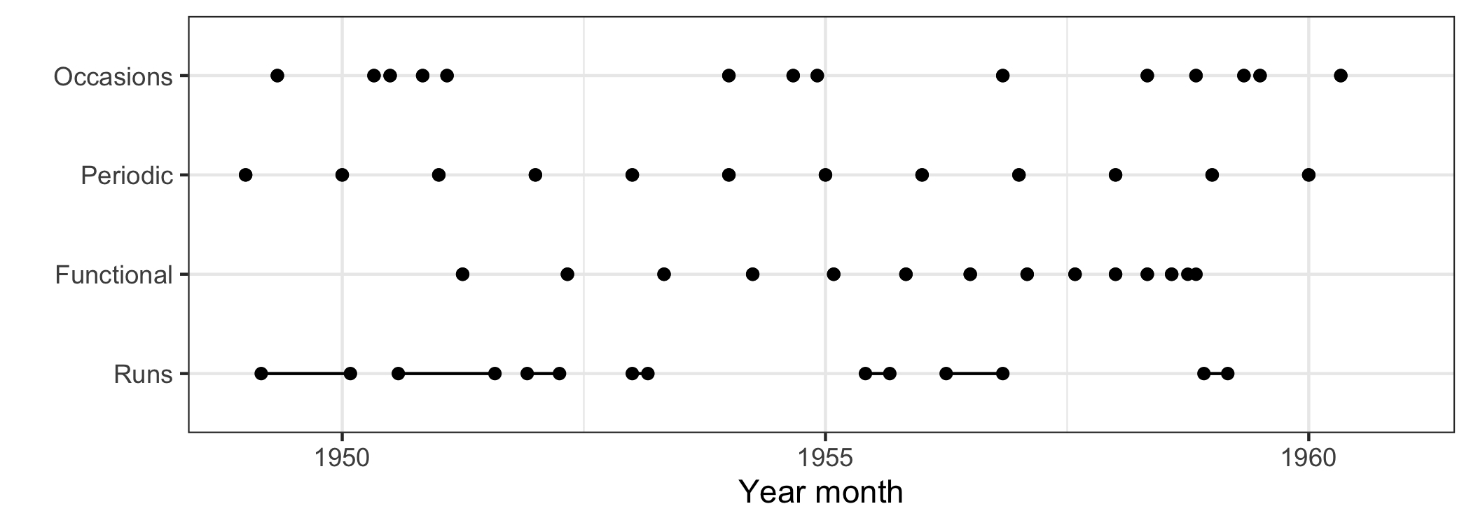
Figure 4.2: The range plot gives an exclusive focus on missing data over time, a graphical realization of the RLE <NA>. The dot indicates a single missing point, and a line range suggests the missings at runs. It is easier to compare and contrast the locations and run lengths of missings across series.
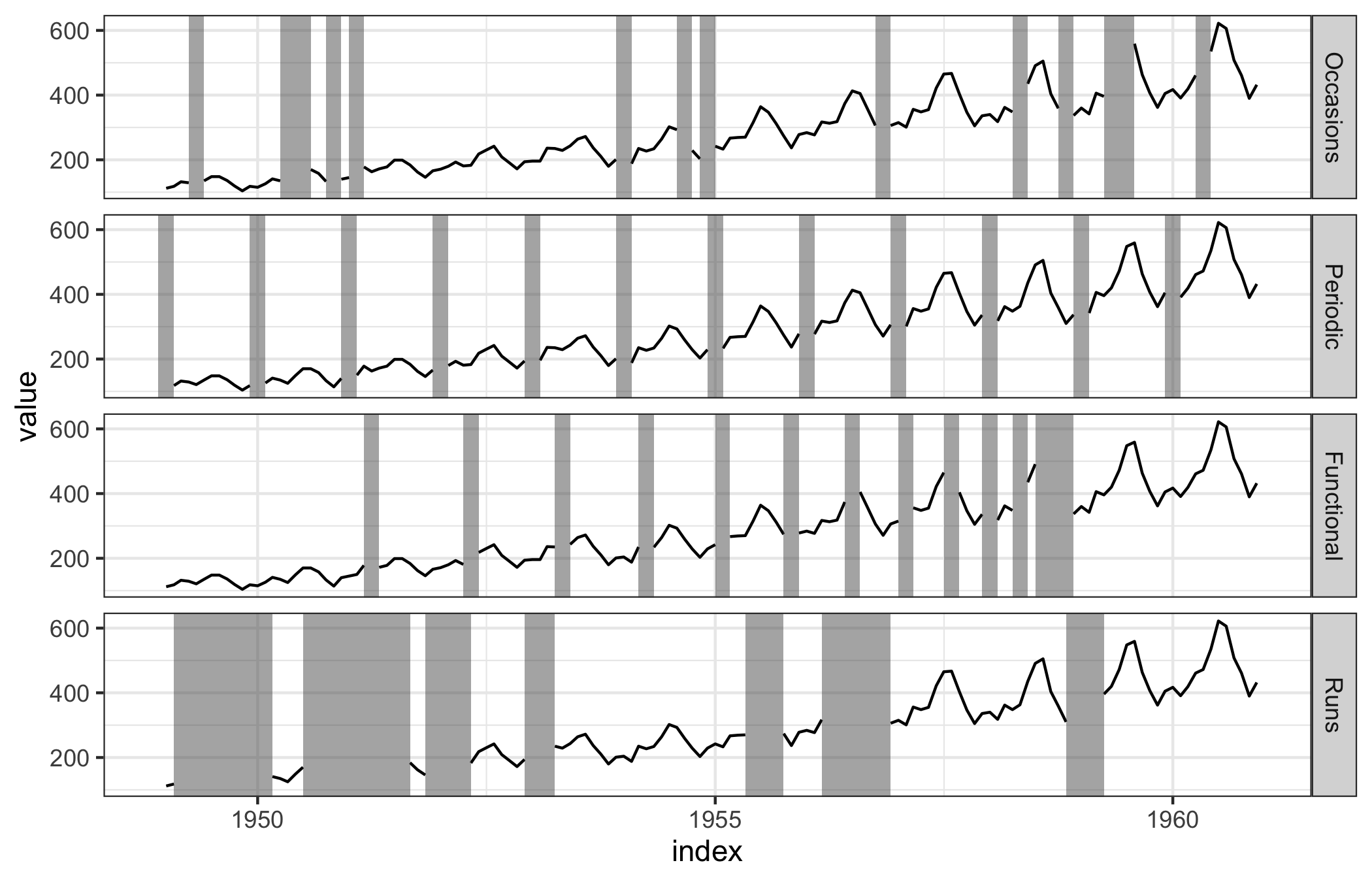
Figure 4.3: The jailbird plot puts the focus on the locations and lengths of missing values, which allows for better detection of different patterns. Using gray for the bars, with black lines for the complete values, enables the continuity principle of perception to take effect. Implicitly, the viewer’s brain imputes the missings to extend the series through the “occluded” parts.
Figure 4.3 focuses on the distribution of missing values as well as the data. It is an adaptation of the plot provided by the imputeTS plotNA.distribution() function. A new data layer, associated with the pre-computed RLE <NA>, is visually presented as strips or rectangles to the existing data plot of Figure 4.1, and we have aptly named it a jailbird plot. The purpose of the strips is perceptual: they both mark the location of missings and draw attention to these times, but they stimulate the continuity principle of perception where our brains mentally fill in the gap with a pseudo-imputed value.
4.4.2 Visualizing aggregations
Visualizing aggregations summarizes run lengths of missing data, for example the occurrences of distinctive runs and the tallies. The imputeTS package implements this idea in the form of bar charts as the plotNA.gapsize() function. Figure 4.4 shows this plot, which contrasts the counting of missing values occurring by the two mechanisms, Missing at Occasions and Runs. It takes some time to digest this plot. The number of runs is a as categorical variable, with the left bar mapped to the frequencies and the right mapped to total missings. The confusion arises from Figure 4.4 because occurrences and tallies are separated as colored bars but the count is displayed on the same axis. A better alternative to use a spineplot to represent this information (Figure 4.5). A spine plot is a special case of a mosaic plot (Hofmann 2006). A 100% bar is mapped to a run length: the width displays the number of occurrences, and the corresponding bar area is naturally the total number of missings, both of which remain treated as quantitative variables.
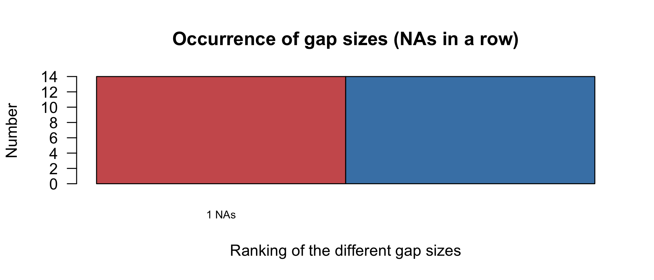
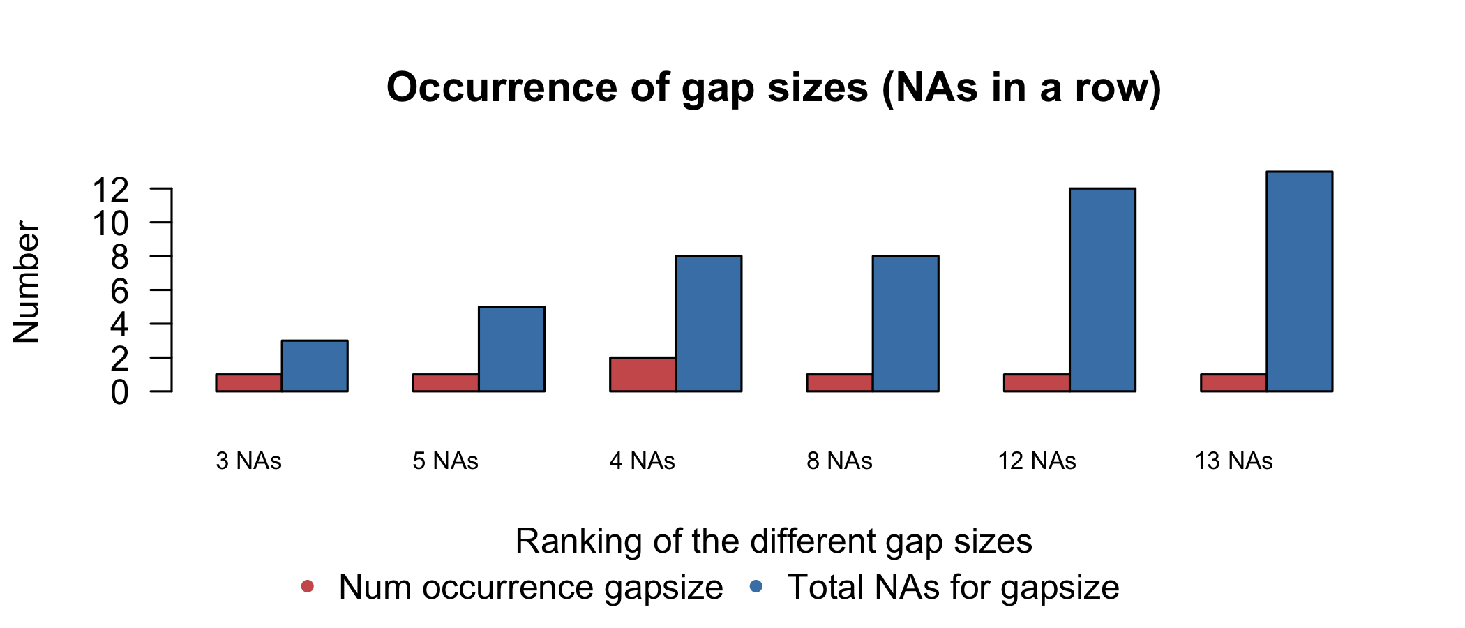
Figure 4.4: The occurrence plot show the summaries of distinct gap sizes, provided by the imputeTS package. The left-hand bar gives the number of occurrences for each gap size, with the corresponding tallies of NA on the right-hand side.
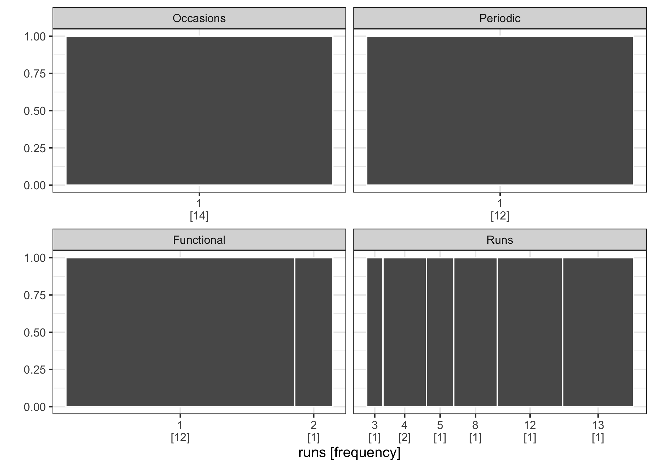
Figure 4.5: The gasp plot turns the focus from distributions to aggregations of run lengths, for the four missing patterns. Missing at Runs is clearly differentiated from the rest.
Figure 4.5 demonstrates the use of the gasp plot (also known as the spineplot) for visualizing the aggregations of missingness in time. Since the plot is faceted by the four types, it shows the individual distribution of run lengths and compares between, but puts no emphasis on the association between them. The four types of missing patterns produce quite different gasp plots.
Figure 4.6 explores the idea of how missings intersect on the two variables. The 100% of the bar in Figure 4.5 is replaced by the proportion of intersection with another variable. The missing values of the Occasions type intersects with the Runs type by 25% in the left panel. The right panel interchanges two variables, and indicates that there is little overlap on the long runs. This also showcases the use of the set operation intersect().
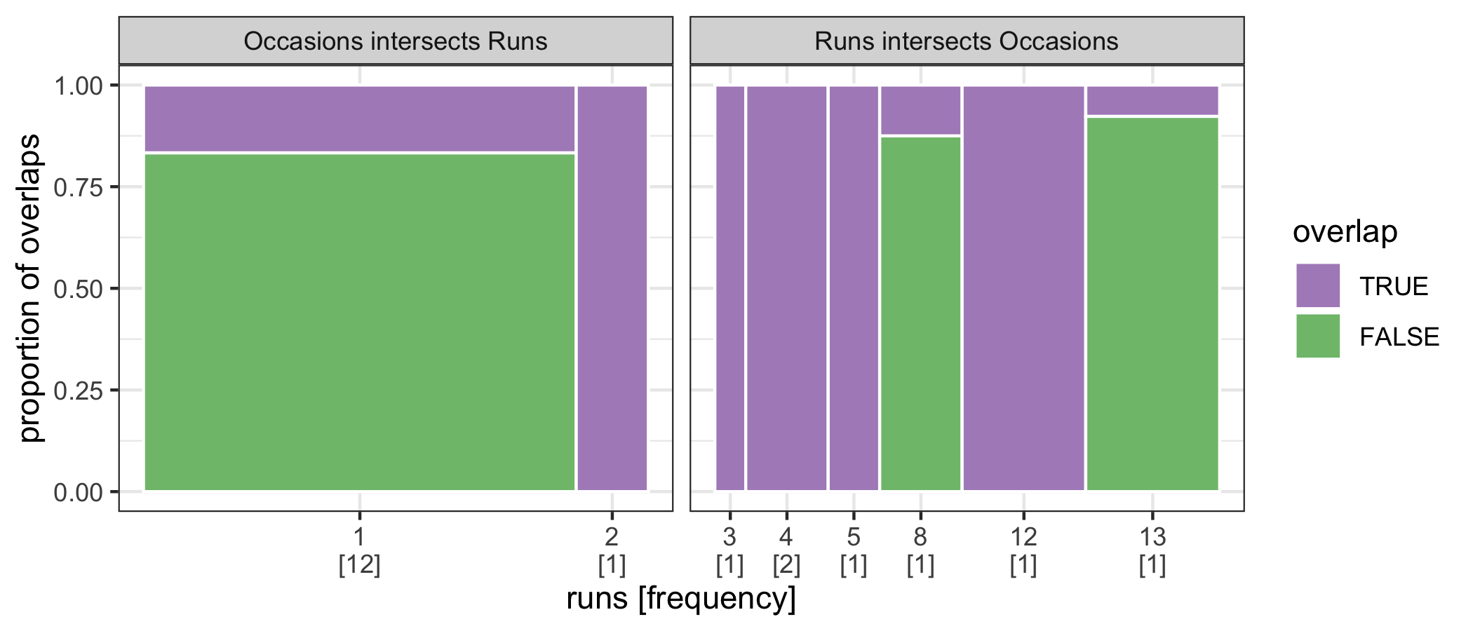
Figure 4.6: The spineplot is extended to temporal missing data for exploring associations based on their run lengths. The purple area highlights their intersections in time. The Runs type overlaps the Occasions in the longer run.