2.2 Creating a calendar display
2.2.1 Data transformation
The algorithm of transforming data for constructing a calendar plot uses modular arithmetic, similar to that used in the glyph map displays for spatio-temporal data (Wickham et al. 2012). To make a year long calendar requires cells for days, embedded in blocks corresponding to months, organized into a grid layout for a year. Each month conforms to a layout of 5 rows and 7 columns, where rows and columns refer to weeks of the month and days of the week respectively. These cells provide a micro canvas on which to plot the data. The first day of the month could be any of Monday–Sunday, which is deterministic given the year of the calendar. Months are of different lengths, ranging from 28 to 31 days. Some months could extend over six weeks, but for these months the last few days are wrapped up to the top row of the block for compactness, and because it is convention. The fifth row could be blank for February if the month starts on Monday. The notation for creating these cells is as follows:
- is the day of the week, that is the first day of the month.
- or representing the number of days in any month.
- is the grid position, where is the row (week of the month), and is the column (day of the week), with being in the upper left corner.
- indexes the day in the month, inside the 35 possible cells.
The grid position for any day in the month is given by
To create the layout for a full year, denotes the position of the month arranged in the plot, where is the row and is the column; denotes the small amount of white space between each month for visual separation.
Each cell forms a canvas on which to draw the data. Initialize the canvas to have limits both horizontally and vertically. For the pedestrian sensor data, within each cell, hour is plotted horizontally, and count is plotted vertically. Each variable is scaled to have values in , using the minimum and maximum of all the data values to be displayed, assuming fixed scales. Let be the scaled hour, and be the scaled count.
Then the final coordinates for making the calendar plots of the pedestrian sensor data are given by:
Note that for the vertical direction, the top left is the starting point of the grid, which is easier to lay out and why the subtraction is performed. Within each cell, the starting position is the bottom left.
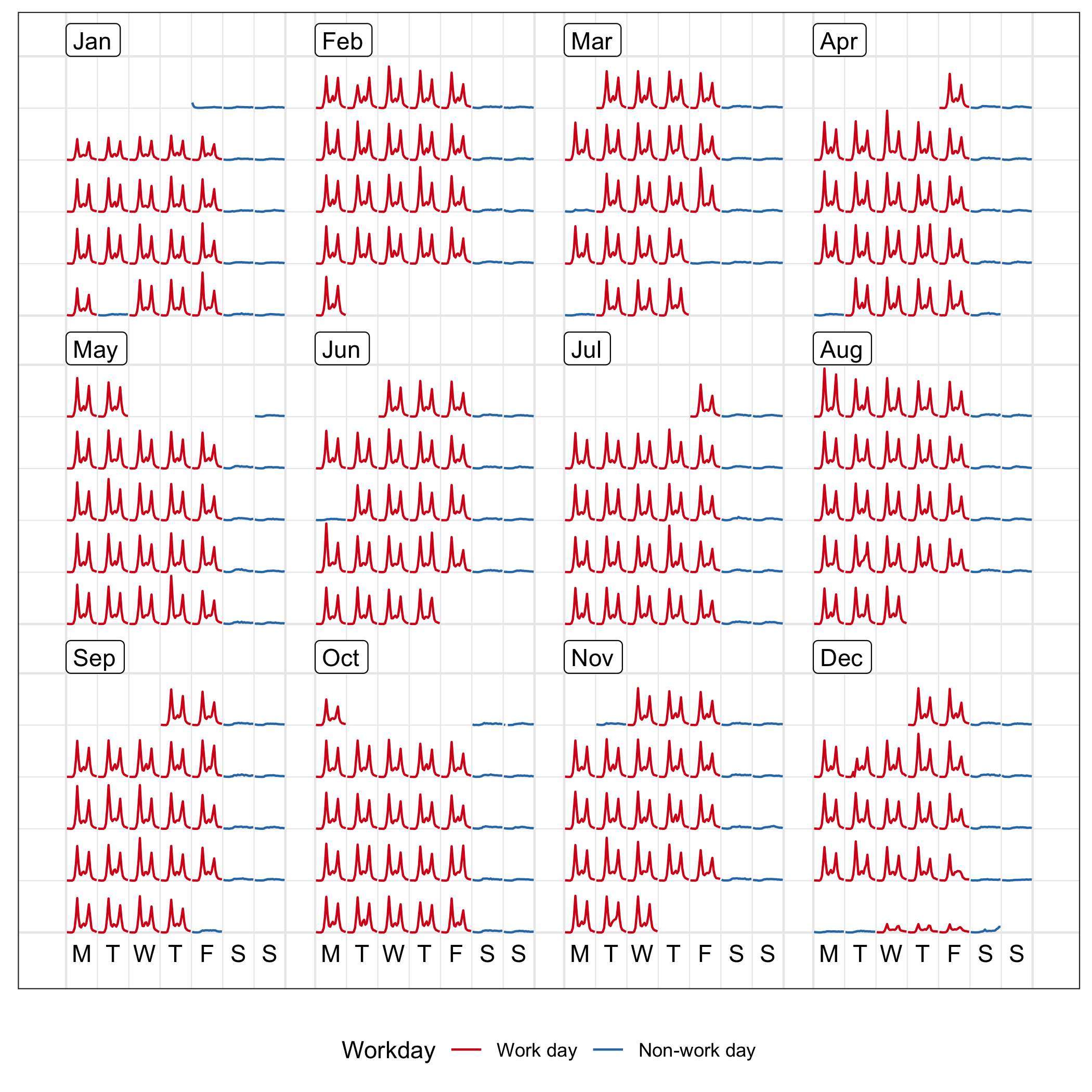
Figure 2.4: The calendar plot of hourly foot traffic at Flagstaff Station ranging from 0 to 6952, using line graphs. The disparities between weekday and weekend along with public holiday, are immediately apparent. The arrangement of the data into a monthly grid represents all the traffic in 2016. Note that the algorithm wraps the last few days in the sixth week to the top row of each month block for a compact layout, which occurs in May and October.
The R package, lubridate (Grolemund and Wickham 2011), is used to extract the components of time, such as days of the week and the number of days in a month, that create the layout. These time variables are converted to integers for the modular arithmetic. Note that for any date-time information is associated with time zone. If your data is collected over multiple time zones, you will need to convert them to the same time zone before conducting any temporal analysis.
Figure 2.4 shows the line graphs framed in the monthly calendar over the year 2016. This is achieved by the frame_calendar() function, which computes the coordinates on the calendar for the input data variables. These can then be plotted using the usual ggplot2 R package (H. Wickham, Chang, et al. 2019). Thus, the grammar of graphics can be applied.
In order to make calendar-based graphics more accessible and informative, reference lines dividing each cell and block, as well as labels indicating weekday and month are also computed before plot construction.
Regarding the monthly calendar, the major reference lines separate every month panel and the minor ones separate every cell, represented by the thick and thin lines in Figure 2.4, respectively. The major reference lines are placed surrounding every month block: for each , the vertical lines are determined by and ; for each , the horizontal lines are given by and . The minor reference lines are only placed on the left side of every cell: for each , the vertical division is ; for each , the horizontal is .
The month labels located on the top left using for every . The weekday texts are uniformly positioned on the bottom of the whole canvas, that is , with the central position of a cell for each . Formal axes and labels are discussed later in Section 2.2.3.5.
2.2.2 Options
The algorithm has several optional parameters that modify the layout, direction of display, scales, plot size and switching to polar coordinates. These are accessible to the user by the inputs to the function frame_calendar():
frame_calendar(data, x, y, date, calendar = "monthly", dir = "h",
  week_start = 1, nrow = NULL, ncol = NULL, polar = FALSE,
  scale = "fixed", width = 0.95, height = 0.95, margin = NULL)
It is assumed that the data is in tidy format (Wickham 2014), and x, y are the variables that will be mapped to the horizontal and vertical axes in each cell. For example in Figure 2.4, the x is the time of the day, and y is the count. The date argument specifies the date variable in the data, facilitating the range of dates plotted in the calendar layout.
The algorithm handles displaying a single month or several years. The arguments nrow and ncol specify the layout of multiple months. For some time frames, some arrangements may be more beneficial than others. For example, to display data for three years, setting nrow = 3 and ncol = 12 would show each year on a single row.
2.2.2.1 Layouts
The monthly calendar is the default, but two other formats, weekly and daily, are available with the calendar argument. The daily calendar arranges days along a row, one row per month. The weekly calendar stacks weeks of the year vertically, one row for each week, and one column for each day. The reader can scan down all the Mondays of the year, for example. The daily layout puts more emphasis on day of the month. The weekly calendar is appropriate if most of the variation can be characterized by days of the week. On the other hand, the daily calendar should be used when there is a yearly effect but not a weekly effect in the data (for example, weather data). When both effects are present, the monthly calendar would be a better choice. Temporal patterns motivate which variant should be employed.
2.2.2.2 Orientation
By default, grids are laid out horizontally. This can be transposed by setting the dir parameter to "v", in which case and are swapped in Equation (2.1). This can be useful for creating calendar layouts for countries where vertical layout is the convention.
2.2.2.3 Start of the week
The start of the week for a monthly calendar is adjustable. The default is Monday (1), which is chosen from the data perspective. The week, however, can begin with Sunday (7) as commonly used in the US and Canada, or other weekday, subject to different countries and cultures.
2.2.2.4 Polar transformation
When polar = TRUE, a polar transformation is carried out on the data. The computation is similar to the one described in Wickham et al. (2012). This produces star glyphs (Chambers et al. 1983), where time series lines are transformed in polar coordinates, embedded in the monthly calendar layout. It is most useful in exhibiting cyclical patterns in the data.
2.2.2.5 Scales
By default, global scaling is done for values in each plot, with the global minimum and maximum used to fit values into each cell. If the emphasis is on comparing trend rather than magnitude, it is useful to scale locally. For temporal data, this would harness the temporal components. The choices include: free scale within each cell (free), cells derived from the same day of the week (free_wday), or cells from the same day of the month (free_mday). The scaling allows for the comparisons of absolute or relative values, and the emphasis of different temporal variations.
With local scaling, the overall variation gives way to the individual shape. Figure 2.5 shows the same data as Figure 2.4, scaled locally using scale = "free". The daily trends are magnified.
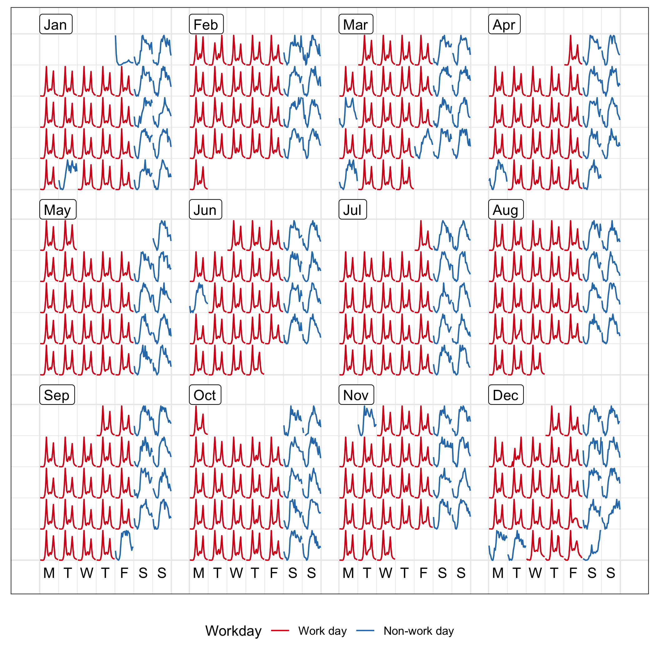
Figure 2.5: Line graphs on the calendar format showing hourly foot traffic at Flagstaff Station, scaled individually by day. The shape on a single day becomes more distinctive, as compared to Figure 2.4.
The free_wday scales each weekday together. It can be useful to compare trends across weekdays, allowing relative patterns for weekends versus weekdays to be examined. Similarly, the free_mday uses free scaling for any day within a given month.
2.2.2.6 Language support
Most countries have adopted this western calendar layout, while the languages used for weekday and month would be different across countries. Other language specifications than English, for text labeling, are available.
2.2.3 Varieties of calendar display
2.2.3.1 Information overlay
Plots can be layered. A comparison of sensors can be done by overlaying them in the same calendar pane. Figure 2.6 overlays the pedestrian counts for three locations on the same calendar. Differences between the pedestrian patterns at these locations can be more directly compared. For example, the magnitude of the difference in pedestrians at Flagstaff Station at peak hours of commuter can be seen. The big peak in pedestrian counts for special events at Birrarung Marr is clear. Birrarung Marr has a very distinct temporal pattern relative to the other two locations. The nighttime events, such as White Night (third Saturday in February), only affects the foot traffic at the State Library and Birrarung Marr.
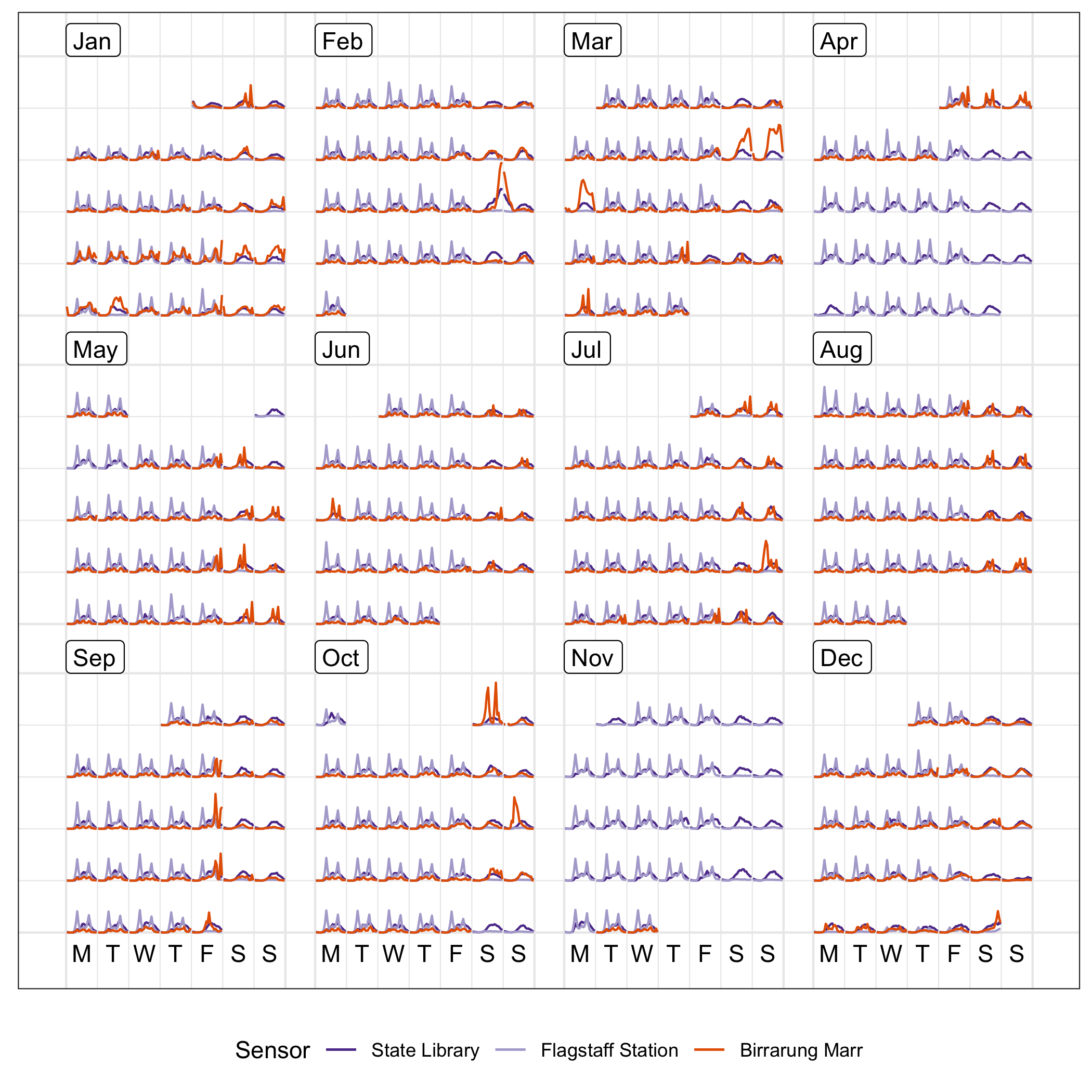
Figure 2.6: Overlaying line graphs of the three sensors in the monthly calendar, to enable a direct comparison of the counts at three locations. They have very different traffic patterns. Birrarung Marr tends to attract large numbers of pedestrians for special events typically held on weekends, contrasting to the bimodal massive peaks showing commuting traffic at Flagstaff Station.
2.2.3.2 Faceting by covariates
To avoid overlapping, when differences between groups are large enough to be seen separately, the calendar layout can be faceted into a series of subplots for the different sensors. Figure 2.7 shows calendar plots that are faceted by sensors. This arrangement allows comparison of the overall structure between sensors, while emphasizing individual sensor variation. In particular, it can be immediately learned that Birrarung Marr was busy and packed over many weekends, but events took place on Friday evenings only in September. The Australian Open, a major international tennis tournament, attracted constant foot traffic in the last two weeks of January. The calendar plot can be faceted by any categorical variable in the data.
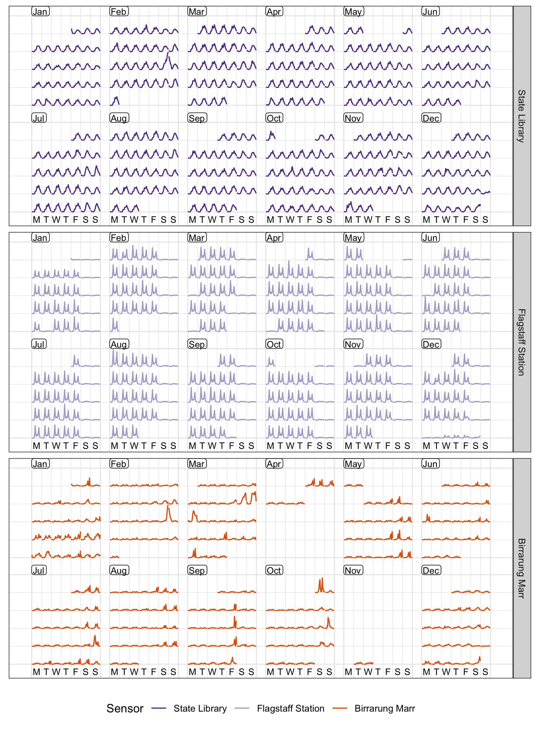
Figure 2.7: Line graphs, embedded in the monthly calendar, colored and faceted by the 3 sensors. The variations of an individual sensor are emphasized.
2.2.3.3 Different types of plots
Many types of plot can be shown in a calendar pane, by taking advantage of the existing ggplot2 plotting capabilities. An example is shown in Figure 2.8: the panes contain lag scatterplots for Flagstaff Station from Week 1 to 17 in 2016, constructed with the scaling for each day and aligning by days of the week, where the lagged hourly count is assigned to the x argument and the current hourly count to the y argument. It indicates strong autocorrelation on weekends, and weak autocorrelation on work days. The V-shape in the weekday graphs arises when the next hour sees a substantial increase or decrease in counts.
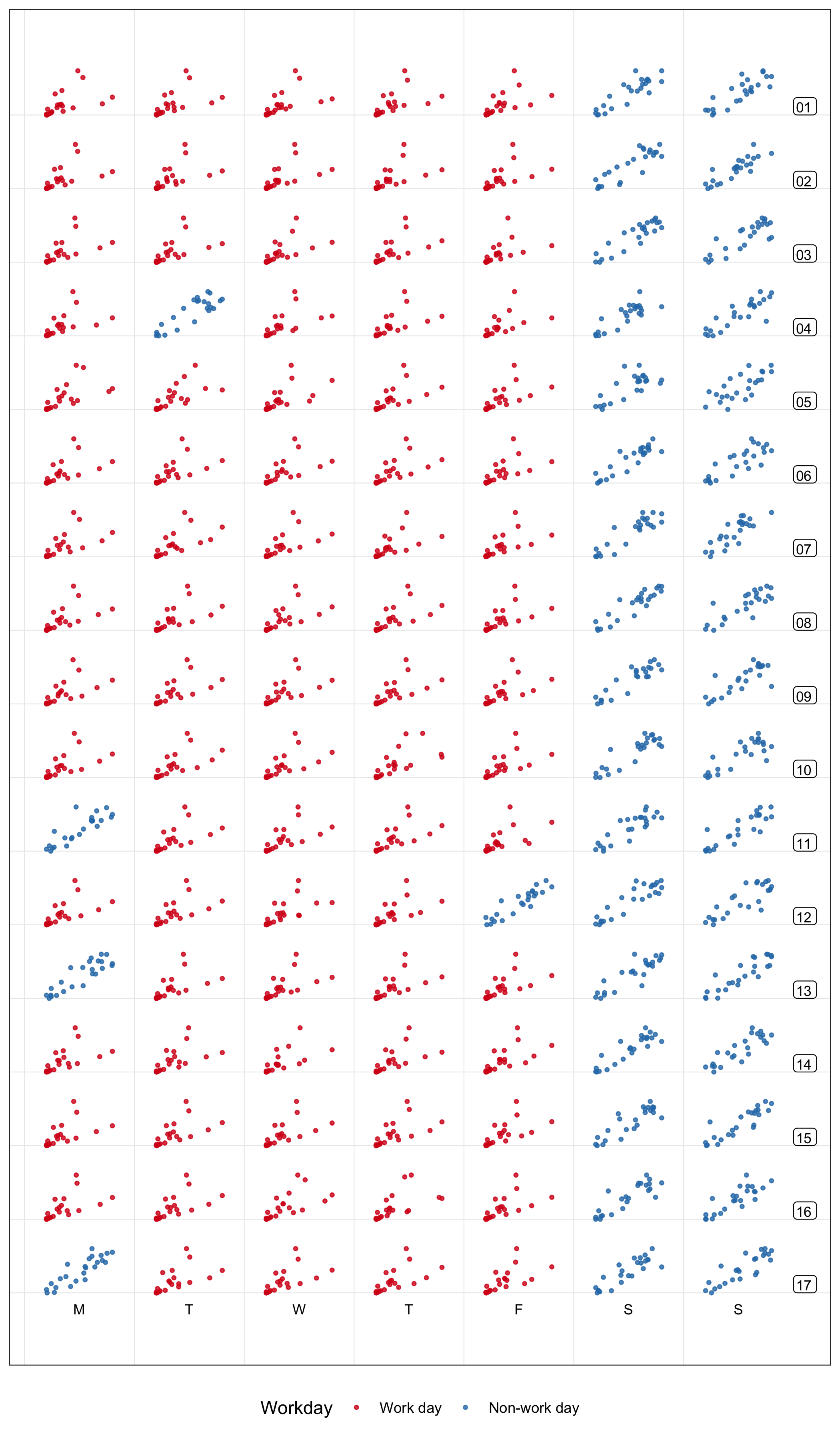
Figure 2.8: Examining lag 1 autocorrelation for Flagstaff Station from week 1 to 17, using lag scatterplots scaled by each day and aligned by days of the week. Each hour’s count is plotted against the previous hour’s count. The autocorrelation is stronger on non-work days (blue) than work days (red).
The algorithm can also produce more complicated plots, such as boxplots. Figure 2.9 uses a loess smooth line (Cleveland 1979) superimposed on side-by-side boxplots. It shows the distribution of hourly counts across all 43 sensors during December. The last week of December is the holiday season: people are off work on the day before Christmas (December 24), go shopping on the Boxing day (December 26), and stay out for the fireworks on New Year’s Eve. The text in the plot is labeled in Chinese, showcasing the support for other languages.
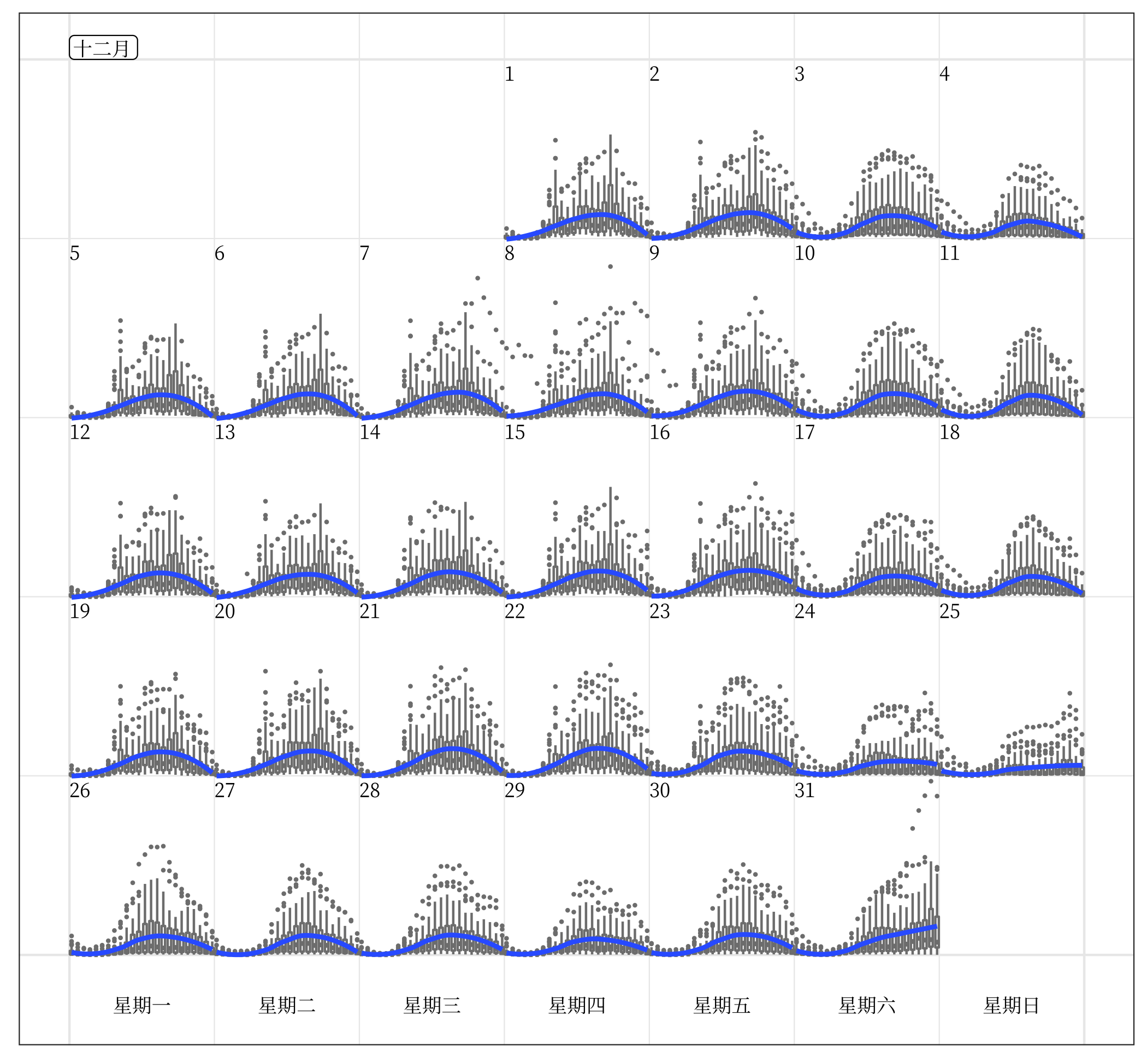
Figure 2.9: Side-by-side boxplots of hourly counts for all the 43 sensors in December 2016, with the loess smooth line superimposed on each day. It shows the hourly distribution in the city as a whole. The increased variability is notable on the last day of December as New Year’s Eve approaches. The month and weekday are labeled in Chinese, which demonstrates the support for languages other than English.
2.2.3.4 Interactivity
The previous calendar plots are static, made with ggplot2. The interactivity of calendar-based displays can be easily enabled, as long as the interactive graphics system remains true to the spirit of the grammar of graphics, for example, plotly (Sievert 2018) in R. As a standalone display, an interactive tooltip can be added to show labels when mousing over a point in the calendar plot, for example the hourly count with the time of day. It is difficult to sense the values from the static display, but the tooltip makes it possible. Options in the frame_calendar() function can be ported to a form of selection button or text input in a graphical user interface like R shiny (Chang et al. 2019). The display will update on the fly accordingly, via clicking or text input, as desired.
Linking calendar displays to other types of charts is valuable to visually explore the relationships between variables. An example can be found in the wanderer4melb shiny application (Wang 2019). The calendar most naturally serves as a tool for date selection: by selecting and brushing the glyphs in the calendar, it subsequently highlights the elements of corresponding dates in other time-based plots. The linking between weather data and calendar displays is achieved using the common dates.
2.2.3.5 Faceted calendar
The frame_calendar() function described in Section 2.2.2 is a data restructuring function, neatly integrating into a data pipeline but it requires two steps: data transformation and then plot. There is also little freedom to tailor axes and labels, because specialist code needs to be applied.
The facet_calendar() integrates the algorithm into the ggplot2 graphical system so that the calendar layout is automatic, and the full functionality of axes, labels, and customization is accessible. A faceting method lays out panels in a grid. The user needs to supply the variable containing dates, in order for the faceting calendar function to prepare the arrangement of panels, as defined by Equation (2.1). The remainder of the plot construction for each panel is handled entirely by ggplot2 internals.
Formal axes and labels unavailable in calendar plots generated by the frame_calendar() are possible (Figure 2.10). It is much easier for readers to infer the scaling (global or local) employed for the plot. Non-existing panels mean non-existing days in the month, and blank panels indicate missing data on the day. This avoids confusion about missing data or days when missingness lives in the ends of month panels, which may occur when using frame_calendar().
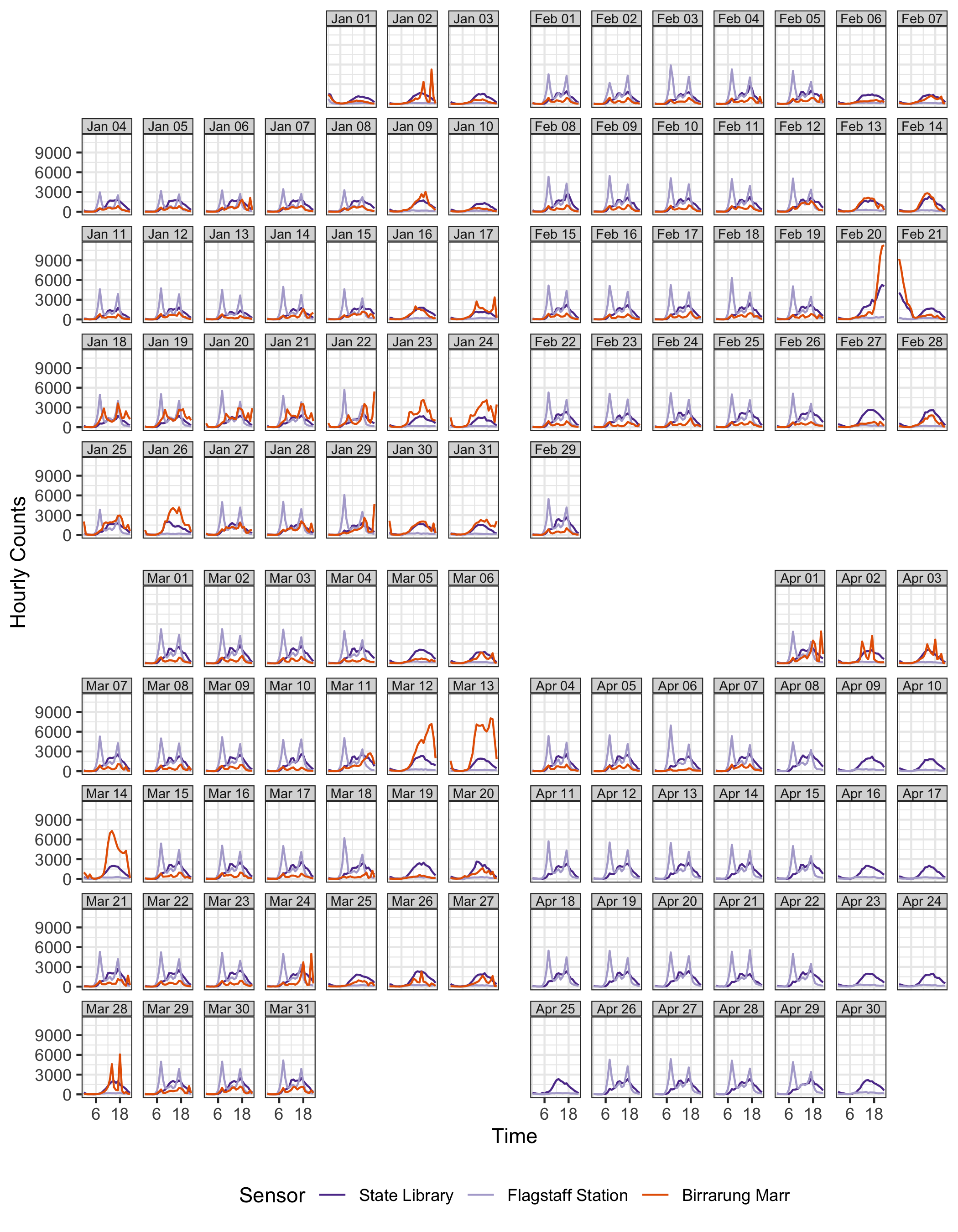
Figure 2.10: A faceted calendar showing a fraction of the data shown in Figure 2.6. The faceted calendar takes more plot real estate than the calendar plot, but it provides native ggplot2 support for labels and axes.
However, the facet_calendar() takes much more run time compared with frame_calendar(). The faceted calendar also uses more plot real estate for panel headings and axes. The reader can compare the two approaches by examining the compact Figure 2.6, relative to Figure 2.10. The space consumed by the former shows a full year, and the latter shows four months, only a third of the data. For fast rendering and economy of space, frame_calendar() is recommended.
2.2.4 Reasons to use calendar-based graphics
The purpose of the calendar display is to facilitate quick discoveries of unusual patterns in people’s activities, which is consistent with why analysts should and do use data visualization. It complements the traditional graphical toolbox used to understand general trends, and better profiles vivid and detailed data stories about the way we live. Comparing the conventional displays (Figure 2.2 and 2.3) with the new display (Figure 2.7), it can be seen that the calendar display is more informatively compelling: when special events happened, and on what day of the week, and whether they were day or night events. For example, Figure 2.7 informs the reader that many events were held in Birrarung Marr on weekend days, while September’s events took place on Friday evenings, which is difficult to discern from conventional displays.