3.6 Case studies
3.6.1 On-time performance for domestic flights in U.S.A
The dataset of on-time performance for US domestic flights in 2017 represents event-driven data caught in the wild, sourced from US Bureau of Transportation Statistics (Bureau of Transportation Statistics 2018). It contains 5,548,445 operating flights with many measurements (such as departure delay, arrival delay in minutes, and other performance metrics) and detailed flight information (such as origin, destination, plane number, etc.) in a tabular format. This kind of event describes each flight scheduled for departure at a time point in its local time zone. Every single flight should be uniquely identified by the flight number and its scheduled departure time, from a passenger’s point of view. In fact, it fails to pass the tsibble hurdle due to duplicates in the original data. An error is immediately raised when attempting to convert this data into a tsibble, and a closer inspection has to be carried out to locate the issue. The tsibble package provides tools to easily locate the duplicates in the data with duplicates(). The problematic entries are shown below.
#>   flight_num  sched_dep_datetime  sched_arr_datetime dep_delay arr_delay
#> 1      NK630 2017-08-03 17:45:00 2017-08-03 21:00:00       140       194
#> 2      NK630 2017-08-03 17:45:00 2017-08-03 21:00:00       140       194
#>   carrier tailnum origin dest air_time distance origin_city_name
#> 1      NK  N601NK    LAX  DEN      107      862      Los Angeles
#> 2      NK  N639NK    ORD  LGA      107      733          Chicago
#>   origin_state dest_city_name dest_state taxi_out taxi_in carrier_delay
#> 1           CA         Denver         CO       69      13             0
#> 2           IL       New York         NY       69      13             0
#>   weather_delay nas_delay security_delay late_aircraft_delay
#> 1             0       194              0                   0
#> 2             0       194              0                   0
The issue was perhaps introduced when updating or entering the data into a system. The same flight is scheduled at exactly the same time, together with the same performance statistics but different flight details. As flight NK630 is usually scheduled at 17:45 from Chicago to New York (discovered by searching the full database), a decision is made to remove the first row from the duplicated entries before proceeding to the tsibble creation.
This dataset is intrinsically heterogeneous, encoded in numbers, strings, and date-times. The tsibble framework, as expected, incorporates this type of data without any loss of data richness and heterogeneity. To declare the flight data as a valid tsibble, column sched_dep_datetime is specified as the “index”, and column flight_num as the “key”. This data happens to be irregularly spaced, and hence switching to the irregular option is necessary. The software internally validates if the key and index produce distinct rows, and then sorts the key and the index from past to recent. When the tsibble creation is done, the print display is data-oriented and contextually informative, including dimensions, irregular interval with the time zone (5,548,444 x 22 [!] <UTC>) and the number of observational units (flight_num [22,562]).
#> # A tsibble: 5,548,444 x 22 [!] <UTC>
#> # Key:       flight_num [22,562]
Transforming a tsibble for exploratory data analysis with a suite of time-aware and general-purpose manipulation verbs can result in well-constructed pipelines. A couple of use cases are described to show how to approach the questions of interest by wrangling the tsibble while maintaining its temporal context.
What time of day and day of week should passengers travel to avoid suffering from horrible delay? Figure 3.5 plots hourly quantile estimates across day of week in the form of small multiples. The upper-tail delay behaviors are of primary interest, and hence 50%, 80% and 95% quantiles are computed. This pipeline is initialized by regularizing and reshaping the list of the upper quantiles of departure delays for each hour. To visualize the temporal profiles, the time components (for example hours and weekdays) are extracted from the index. The flow chart (Figure 3.6) demonstrates the operations undertaken in the data pipeline. The input to this pipeline is a tsibble of irregular interval for all flights, and the output ends up with a tsibble of one-hour interval by quantiles. To reduce the likelihood of suffering a delay, it is recommended to avoid the peak hour around 6pm (18) from Figure 3.5.
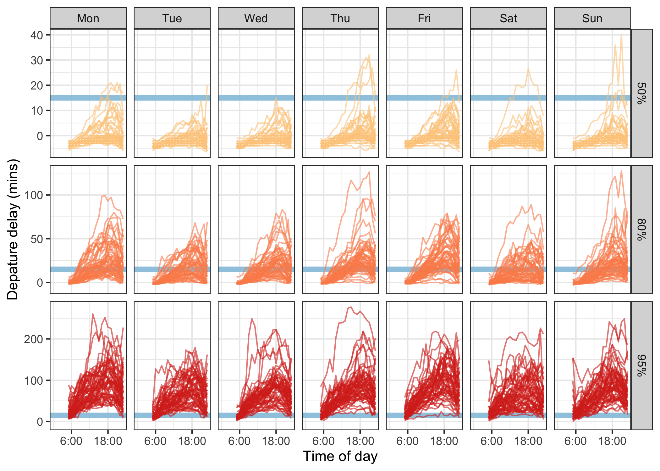
Figure 3.5: Line plots showing departure delay against time of day, faceted by day of week and 50%, 80% and 95% quantiles. The blue horizontal line indicates the 15-minute on-time standard to help grasp the delay severity. Passengers are more likely to experience delays around 18 during a day, and are recommended to travel early. The variations increase substantially as the upper tails.

Figure 3.6: Flow chart illustrates the pipeline that preprocesses the data for creating Figure 3.5.
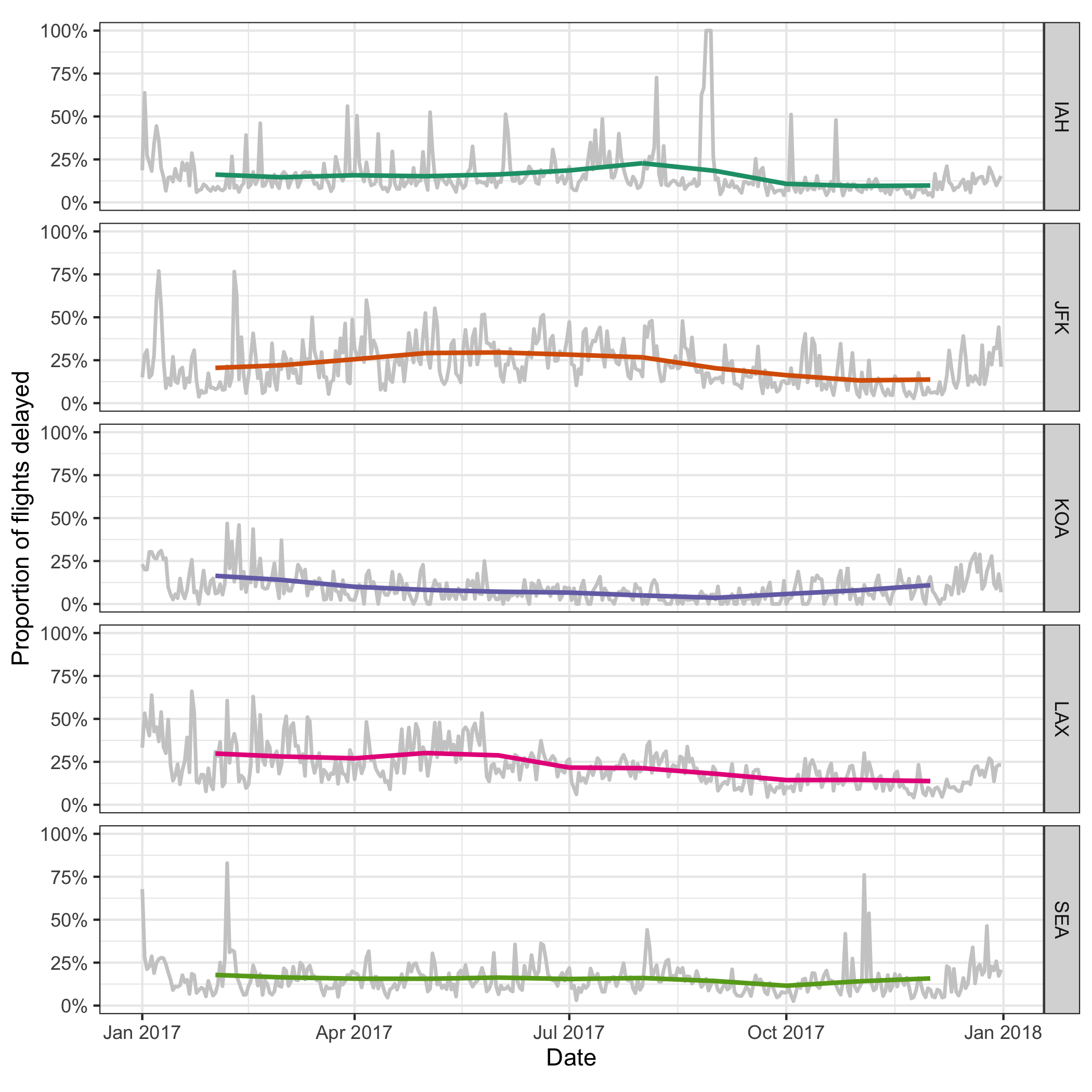
Figure 3.7: Daily delayed percentages for flight departure, with two-month moving averages overlaid, at five international airports. There are least fluctuations, and relatively fewer delays, observed at KOA airport.
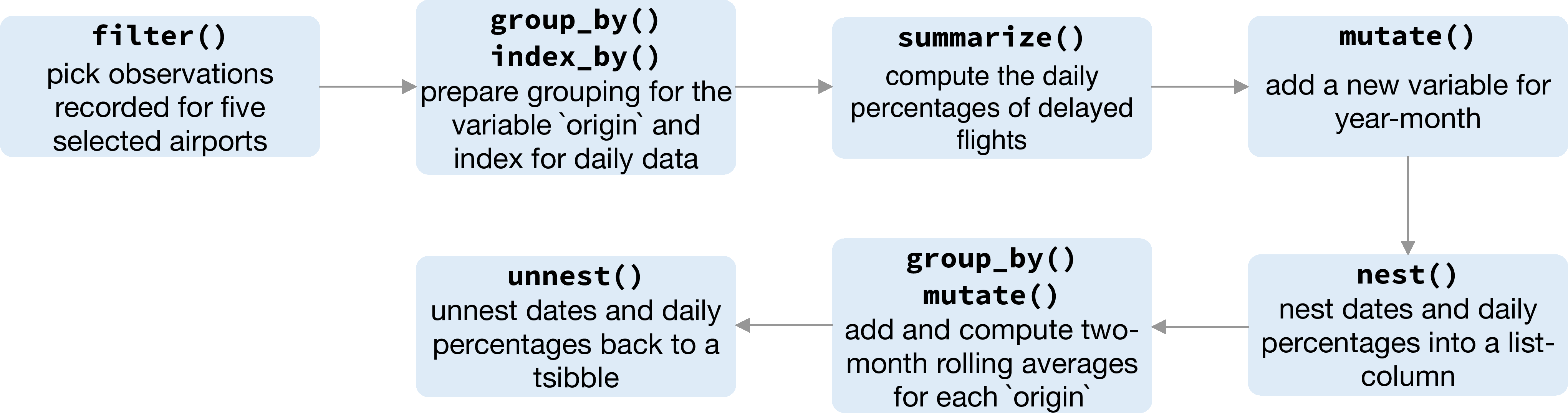
Figure 3.8: Flow chart illustrating the pipeline that preprocessed the data for creating Figure 3.7.
A closer examination of some big airports across the US will give an indication of how well the busiest airports manage the outflow traffic on a daily basis. A subset that contains observations for Houston (IAH), New York (JFK), Kalaoa (KOA), Los Angeles (LAX) and Seattle (SEA) airports is obtained first. The succeeding operations compute delayed percentages every day at each airport, which are shown as gray lines in Figure 3.7. Winter months tend to fluctuate a lot compared to the summer across all the airports. Superimposed on the plot are two-month moving averages, so the temporal trend is more visible. Since the number of days for each month is variable, moving averages over two months will require a weights input. But the weights specification can be avoided using a pair of commonly used rectangling verbs–nest() and unnest(), to wrap data frames partitioned by months into list-columns. The sliding operation with a large window size smooths out the fluctuations and gives a stable trend around 25% over the year, for IAH, JFK, LAX and SEA. LAX airport has seen a gradual decline in delays over the year, whereas the SEA airport has a steady delay. The IAH and JFK airports have more delays in the middle of year, while the KOA has the inverse pattern with higher delay percentage at both ends of the year. This pipeline gets the data into the daily series, and shifts the focus to five selected airports.
This case study begins with duplicates fixing, that resolved the issue for constructing the tsibble. A range of temporal transformations can be handled by many free-form combinations of verbs, facilitating exploratory visualization.
3.6.2 Smart-grid customer data in Australia
Sensors have been installed in households across major cities in Australia to collect data for the smart city project. One of the trials is monitoring households’ electricity usage through installed smart meters in the area of Newcastle over 2010–2014 (Department of the Environment and Energy 2018). Data from 2013 have been sliced to examine temporal patterns of customers’ energy consumption with tsibble for this case study. Half-hourly general supply in kwH has been recorded for 2,924 customers in the data set, resulting in 46,102,229 observations in total. Daily high and low temperatures in Newcastle in 2013 provide explanatory variables other than time in a different data table (Bureau of Meteorology 2019), obtained using the R package bomrang (Sparks et al. 2018). Aggregating the half-hourly energy data to the same daily time interval as the temperature data allows us to join the two data tables to explore how local weather can contribute to the variations of daily electricity use and the accuracy of demand forecasting.
During a power outage, electricity usage for some households may become unavailable, thus resulting in implicit missing values in the database. Gaps in time occur to 17.9% of the households in this dataset. It would be interesting to explore these missing patterns as part of a preliminary analysis. Since the smart meters have been installed at different dates for each household, it is reasonable to assume that the records are obtainable for different time lengths for each household. Figure 3.9 shows the gaps for the top 49 households arranged in rows from high to low in tallies. (The remaining households values have been aggregated into a single batch and appear at the top.) Missing values can be seen to occur at any time during the entire span. A small number of customers have undergone energy unavailability in consecutive hours, indicated by a line range in the plot. On the other hand, the majority suffer occasional outages with more frequent occurrence in January.
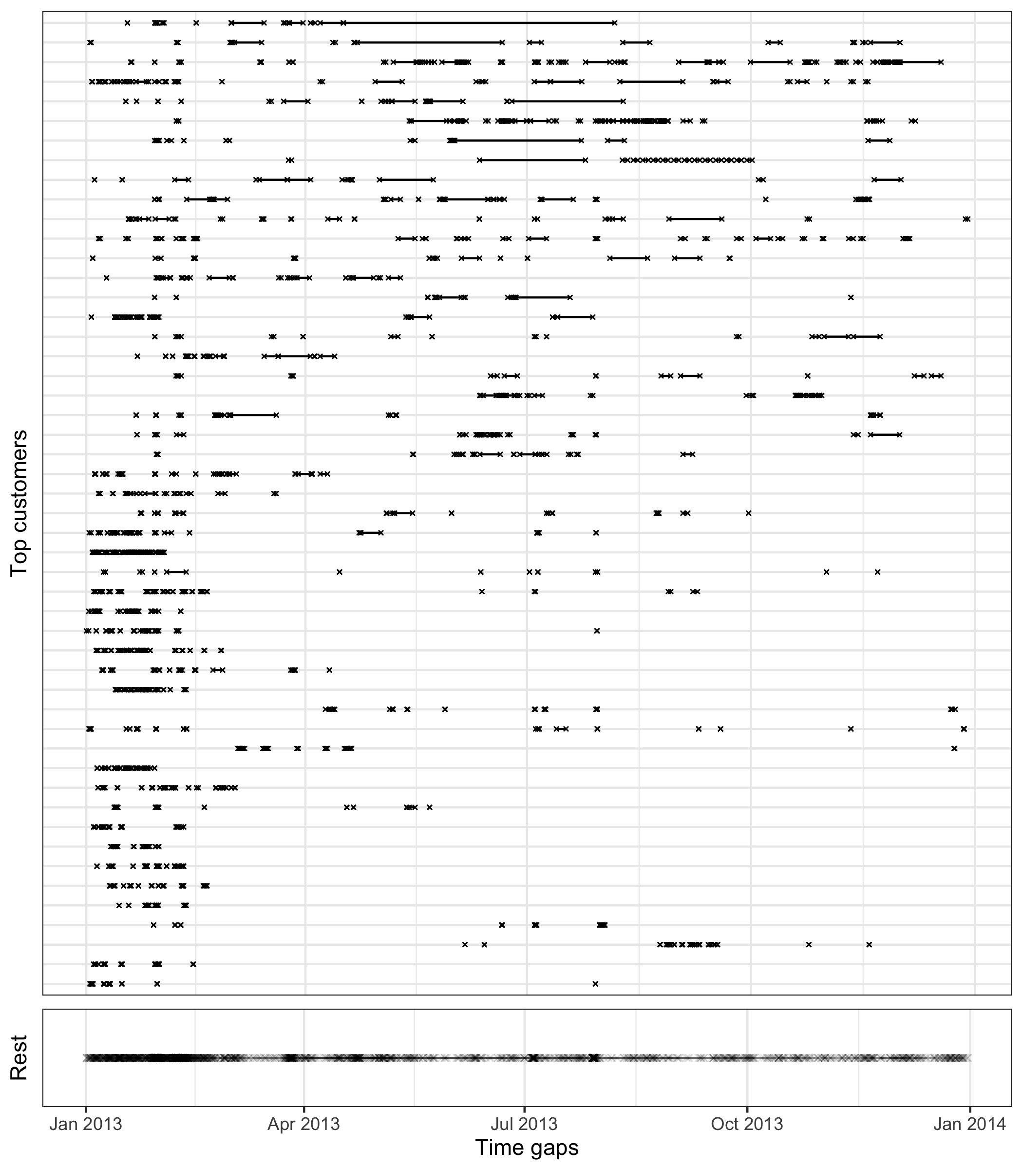
Figure 3.9: Exploring temporal location of missing values, using time gap plots for the 49 customers with most implicit missing values. The remaining customers are grouped into the one line in the bottom panel. Each cross represents an observation missing in time and a line between two dots shows continuous missingness over time. Missing values tend to occur at various times, although there is a higher concentration of missing in January and February for most customers.
Aggregation across all individuals helps to sketch a big picture of the behavioral change over time in the region, organized into a calendar display (Figure 3.10) using the sugrrants package (Wang, Cook, and Hyndman 2018). Each glyph represents the daily pattern of average residential electricity usage every thirty minutes. Higher consumption is indicated by higher values, and typically occurs in daylight hours. Color indicates hot days. The daily snapshots vary depending on the season in the year. During the summer months (December and January), the late-afternoon peak becomes the dominant usage pattern. This is probably driven by the use of air conditioning, because high peaks mostly correspond to hot days, where daily average temperatures are greater than 25 degrees Celsius. In the winter time (July and August) the daily pattern sees two peaks, which is probably due to heating in the morning and evening.
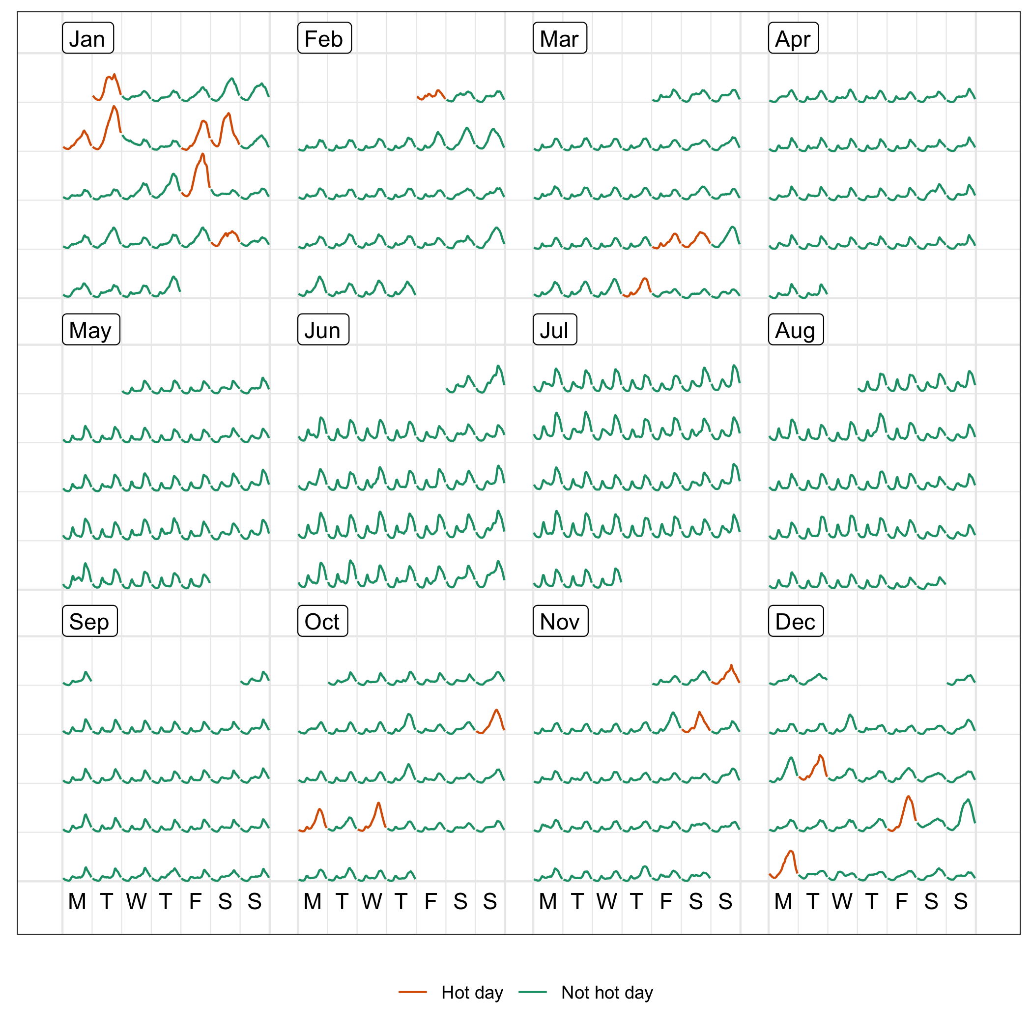
Figure 3.10: Half-hourly average electricity use across all customers in the region, organized into calendar format, with color indicating hot days. Energy use of hot days tends to be higher, suggesting air conditioner use. Days in the winter months have a double peak suggesting morning and evening heater use.
A common practice with energy data analysis is load forecasting, because providers need to know they have capacity to supply electricity. To illustrate the pipeline including modeling, here demand is modeled for December 2013, with the usage forecast for the last day (48 steps ahead because the data is half-hourly). The energy data for the last day is not used for modeling. ARIMA models with and without a temperature covariate are fitted using automatic order selection (Hyndman and Khandakar 2008). The logarithmic transformation is applied to the average demand to ensure positive forecasts. Figure 3.11 plots one-day forecasts from both models against the actual demand, for the last two-week window. The ARIMA model which includes the average temperature covariate gives a better fit than the one without, although both tend to underestimate the night demand. The forecasting performance is reported in Table 3.2, consistent with the findings in Figure 3.11.
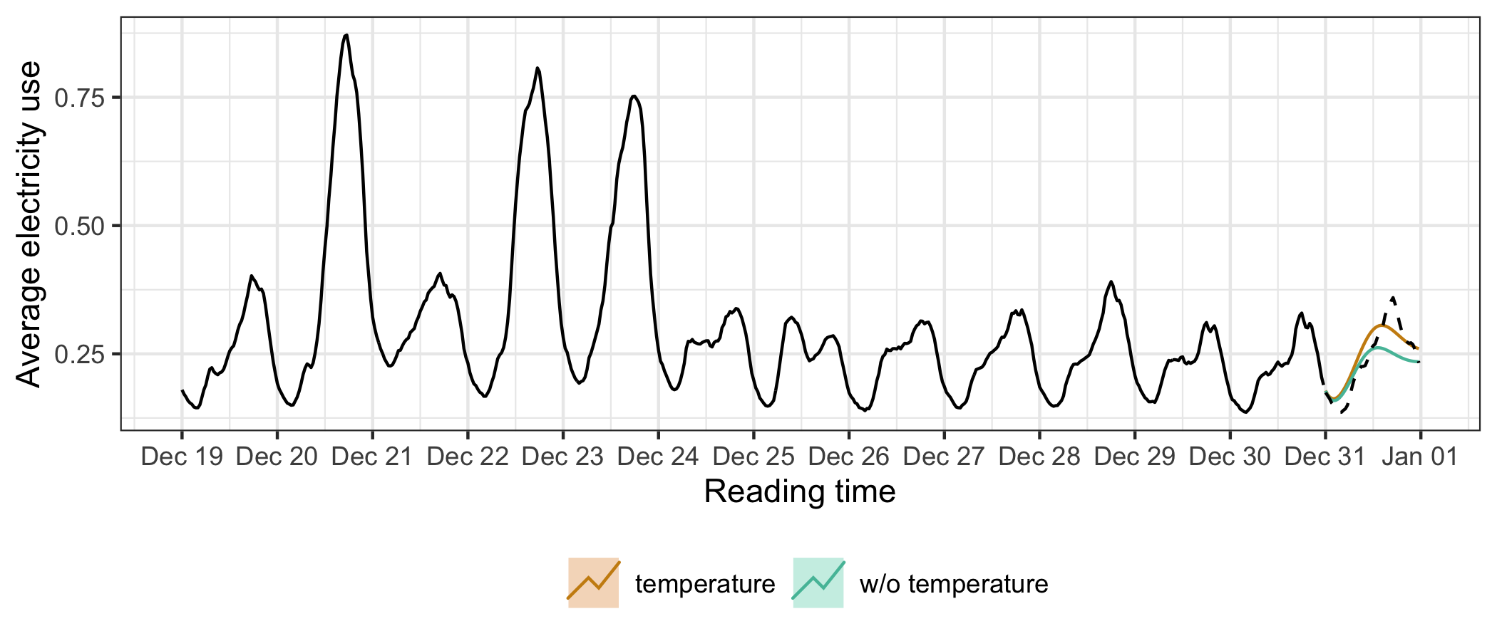
Figure 3.11: One-day (48 steps ahead) forecasts generated by ARIMA models, with and without a temperature covariate, plotted against the actual demand. Both nicely capture the temporal dynamics, but ARIMA with temperature performs better than the model without.
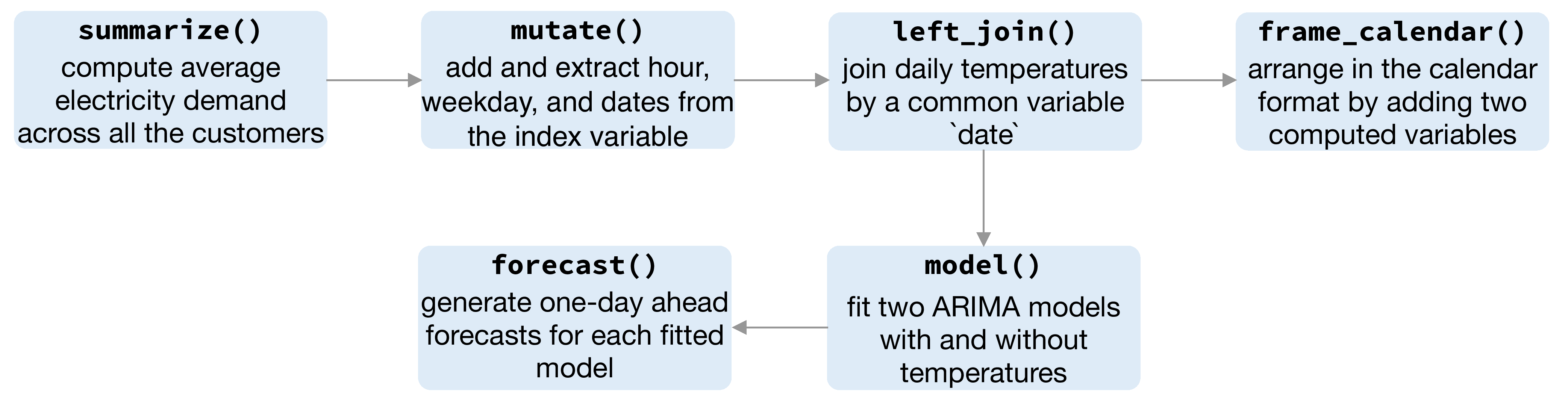
Figure 3.12: Flow chart illustrating the pipeline involved for creating Figure 3.10 and Figure 3.11.
| model | ME | RMSE | MAE | MPE | MAPE |
|---|---|---|---|---|---|
| temperature | -0.009 | 0.030 | 0.025 | -6.782 | 11.446 |
| w/o temperature | 0.016 | 0.043 | 0.032 | 2.634 | 12.599 |
This case study demonstrates the significance of tsibble in lubricating the plumbing of handling time gaps, visualizing, and forecasting in general.