4.6 Applications
4.6.1 World development indicators
The motivating example for the polishing techniques is the World Development Indicators (WDI), sourced from the World Bank Group (2019). The dataset presents 55 national estimates of development indicators from 217 countries and regions around the globe every year from 1969 to 2018 (A data dictionary is given in Table A.1 in Appendix A). It contains 10,850 observations with 44.9% of missing values in the measurements. Figure 4.7 gives the overall picture of missingness in the data. Missingness appears as blocks and strips across observations and variables. Such data involving a great amount of missing values can spark overwhelmingness at the first try. This severely inhibits further analyses.
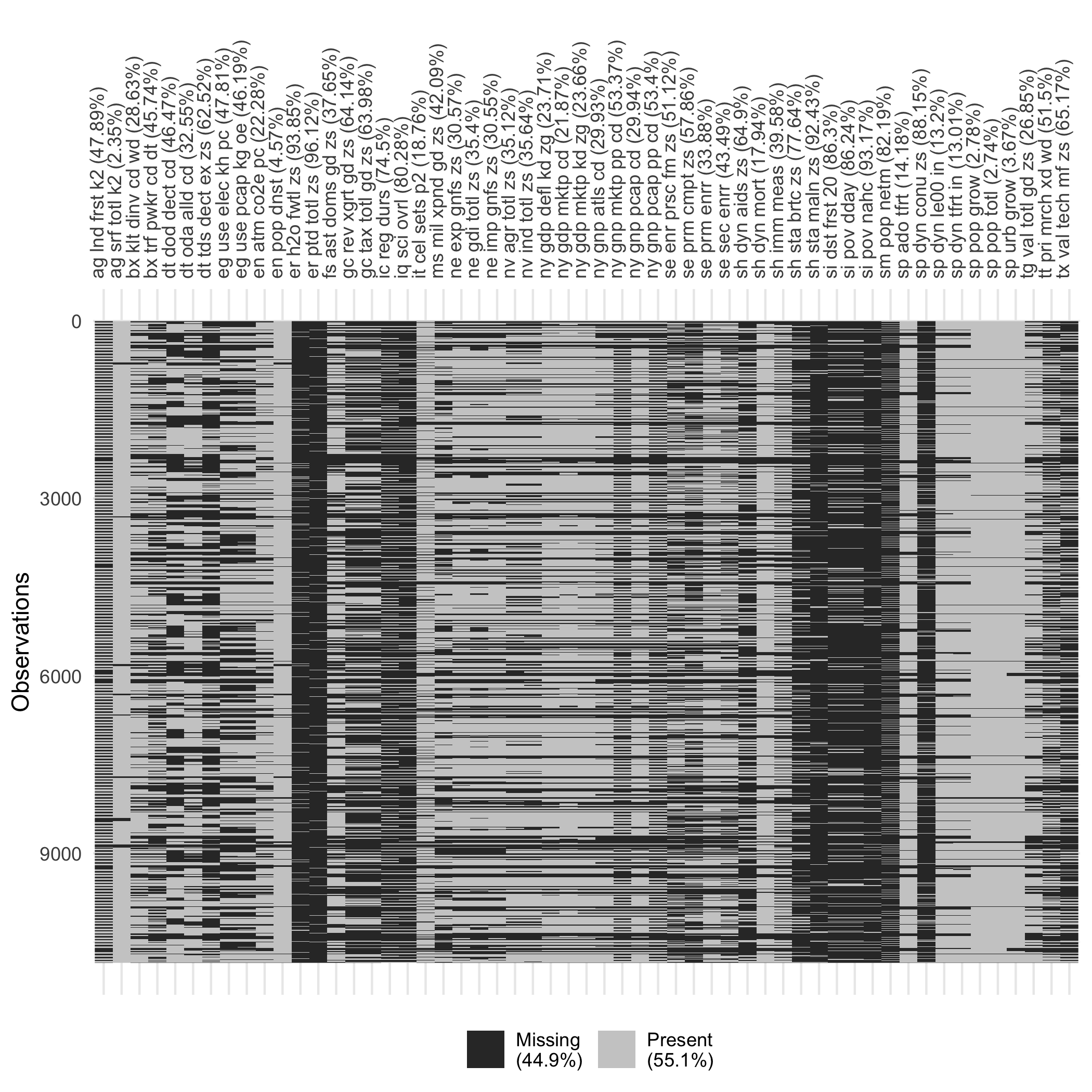
Figure 4.7: Missing data heatmap, with black for missing values and gray for present values. Pixels are arranged as the data cells, reflecting the missingness status. The amount of missings varies vastly by variables.
A grid search on the polishing parameters and is performed on this dataset to study their robustness. After setting to 0 and 0.1 respectively, a sequence of , ranging from 0.4 (worst) to 0.9 (best) by 0.1, are passed to each polisher. This setup gives 2,592 possible combinations for the automatic polishing strategy to take place.
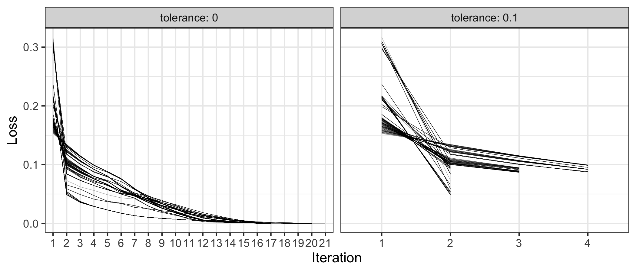
Figure 4.8: The loss metrics against the number of iterations conditional on two tolerance values. When , it can take the number of iterations up to 21, with marginal improvements from the second iteration onwards.
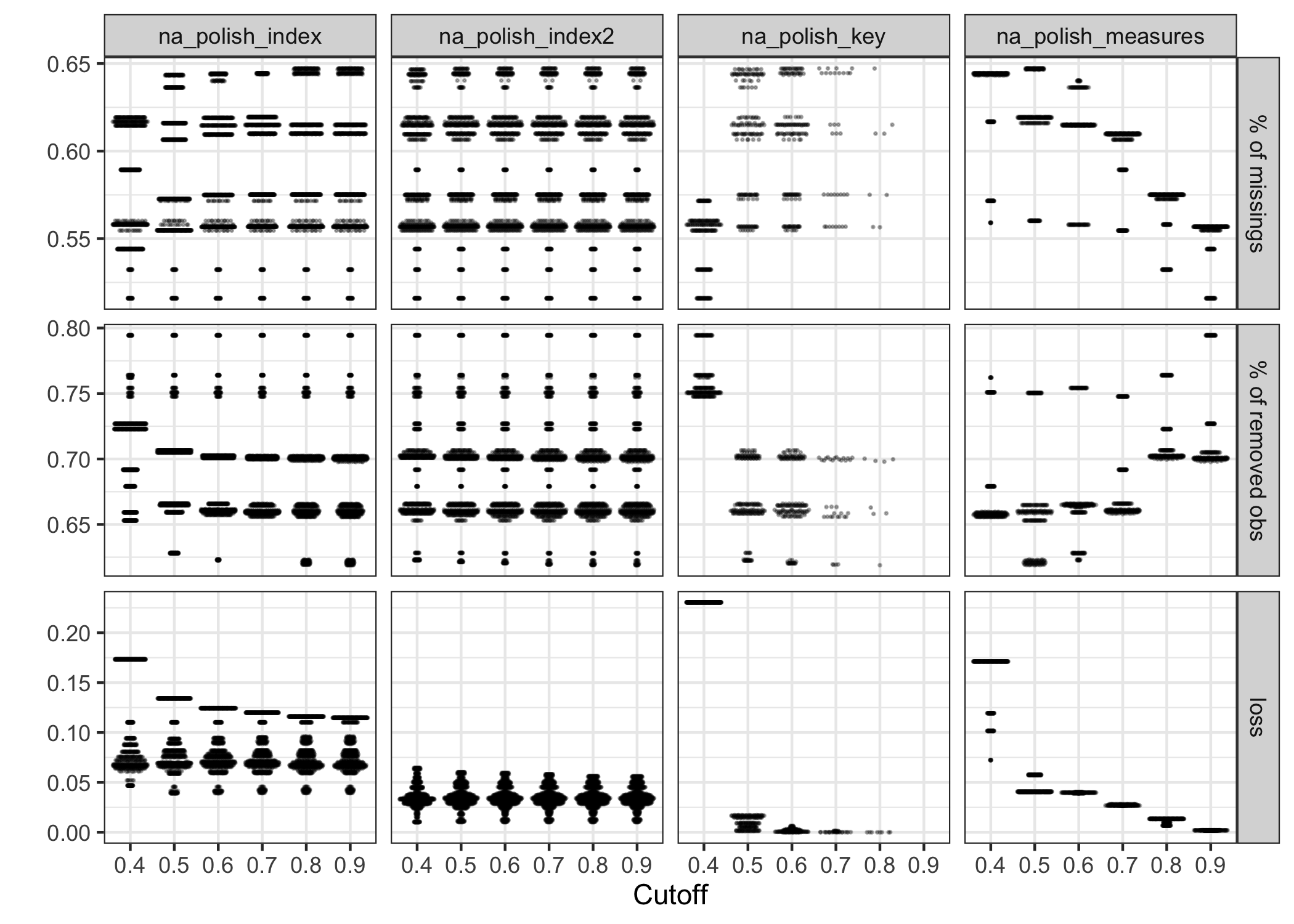
Figure 4.9: The beeswarm plot showing the effect of the grid parameters for four polishers. The choice of cutoff () makes a significant impact on na_polish_key() and na_polish_measures(), but little changes for the polishing indexes (first two columns).
Figure 4.8 exhibits the number of iterations needed to exit the polishing,with given the same set of when or . If , the procedure can take up to 21 iterations to complete; but if , maximum 4 iterations are sufficient. The loss metric dramatically declines from iteration 1 to 2, with a marginal decrease afterwards for both . It suggests is perhaps a right amount of tolerance and saves a considerable amount of computational time. When , Figure 4.9 shows the influence of different values of on the polishing results. Following the rule of minimizing the loss (i.e. maximizing the proportion of missing values while minimizing the proportion of removed data), the polishers na_polish_index(), na_polish_key(), and na_polish_measures(), suggest that 0.5 is a good candidate of . No matter which value takes, the na_polish_index2() polisher behaves constantly.
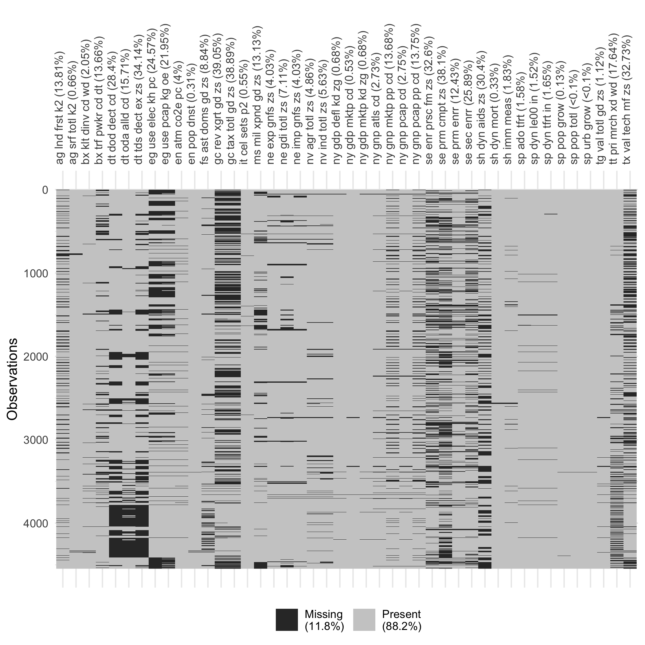
Figure 4.10: Missingness heatmap for the polished data. The polished data gives 11.8% missing values, compared to 44.9% in Figure 4.7.
Using for each polisher and , the automatic polishing process goes through 3 iterations to get the data polished. Removing 11 of 55 variables and 37 of 217 countries, produces a polished data with 11.8% instead of 44.9% missing values. Figure 4.10 displays the missingness map for the polished data. Comparing to the original dataset, the polished subset shrinks in size, but is much more complete, making it more feasible to impute and do further analysis.
The polishing process prepares the data for imputation, and in turn for modeling. Figure 4.11 displays the data pipeline that polishes, filters in and out, imputes, models and forecasts each series. The series for China is used to illustrate the result from this pipeline. In this subset, 14 of 29 variables contain missing data. The jailbird plot (Figure 4.12) is used to highlight the blocks of missings. The red dots represent imputed values, computed using the Stineman interpolation (Stineman 1980; Halldor Bjornsson and Grothendieck 2018) for each series. The results look very consistent for each series. The complete data is passed into Exponential Smoothing models (ETS) and forecast for the next three years. Figure 4.13 shows the point forecasts with 80% and 95% prediction intervals. ETS does not accept any missings, so this pipeline has provided a smooth flow of messy temporal data into tidy model output.
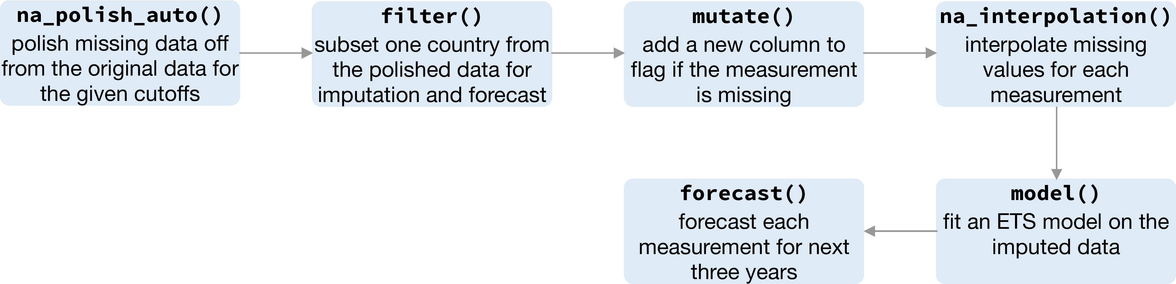
Figure 4.11: The pipeline demonstrates the sequence of functions required for modeling data with a large amount of missings. It begins with the polishing, and then transform, interpolate, model, and forecast.
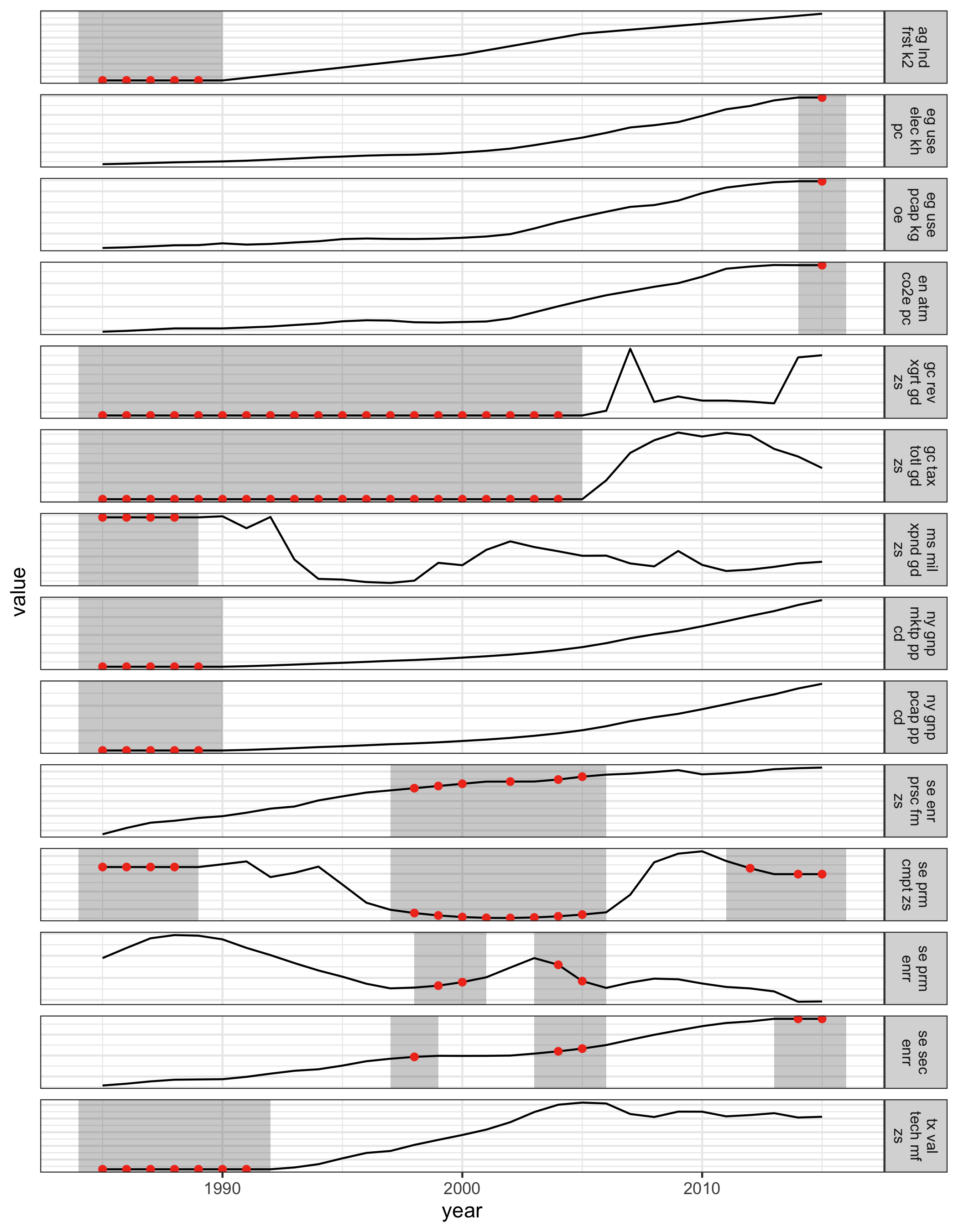
Figure 4.12: The jailbird plot, for the subset of 14 time series from China, overlaid with imputed values (red). The gaps are filled with the well-behaved imputations that are consistent with the complete data.
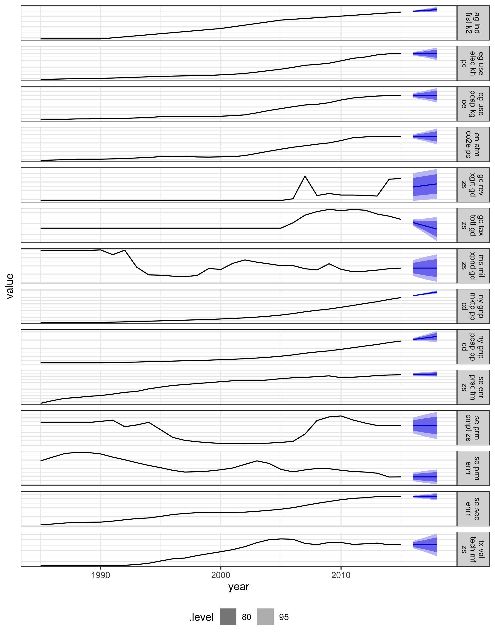
Figure 4.13: Three-year forecasts built with ETS models on the polished and imputed data for China, with 80% and 95% prediction intervals.
4.6.2 Melbourne pedestrian sensors
Many sensors have been installed that track hourly pedestrian tallies in downtown Melbourne (City of Melbourne 2017), as part of the emerging smart city plan. It is valuable for understanding the rhythm of daily life of people in the city. There are numerous missing values, likely due to sensors failing for periods of time. Figure 4.14 illustrates the distributions of missingness in 2016 across 43 sensors, using the range plot organized from the most missing sensor to the least.
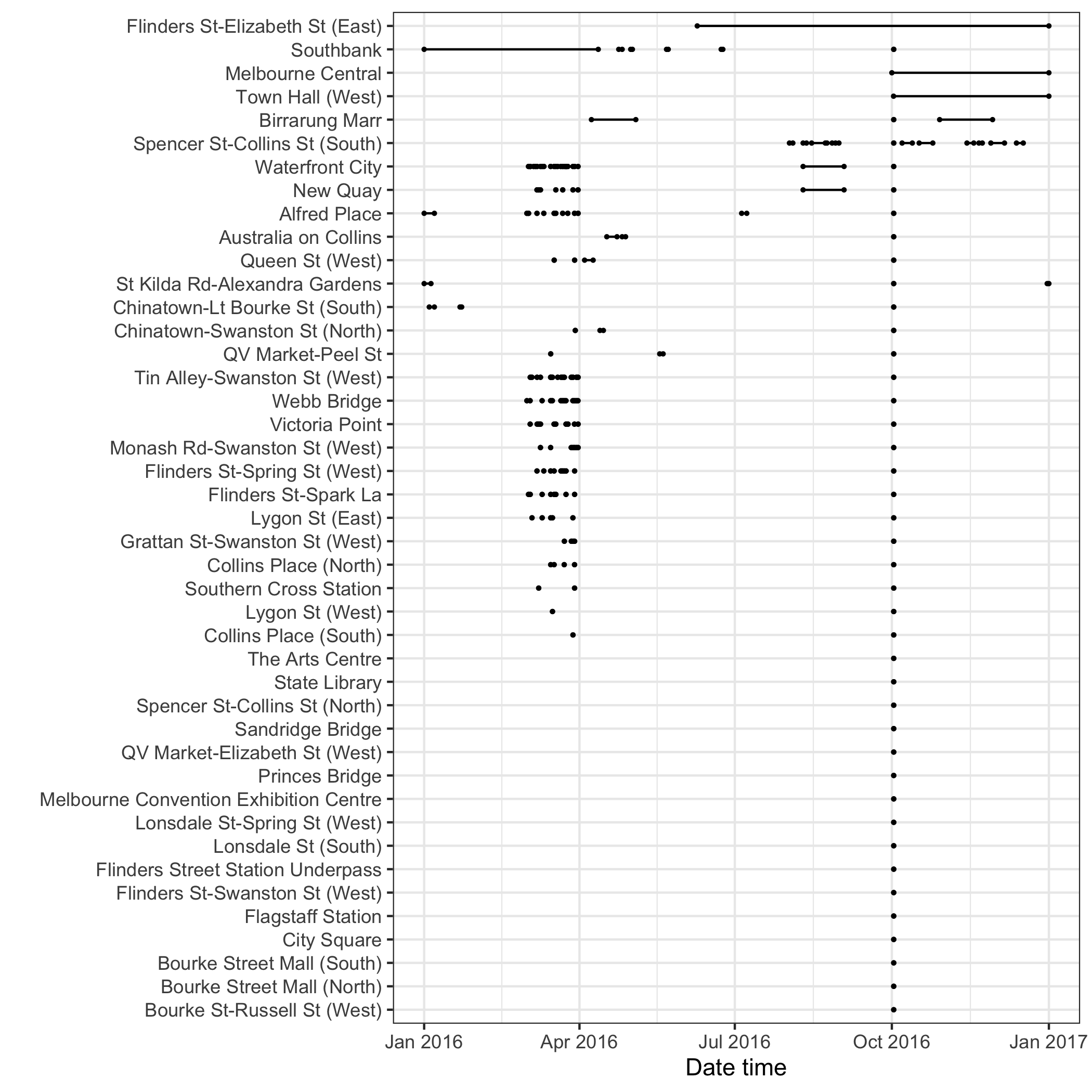
Figure 4.14: The range plot arranges the 43 pedestrian sensors from most missing to the least. Missing at Runs and Occasions can be found in the data. Across series, many missings can be seen to be occurring at similar times. The common missing at the beginning of October is likely the start of daylight savings (summer) time in Melbourne, where an hour disappears from the world.
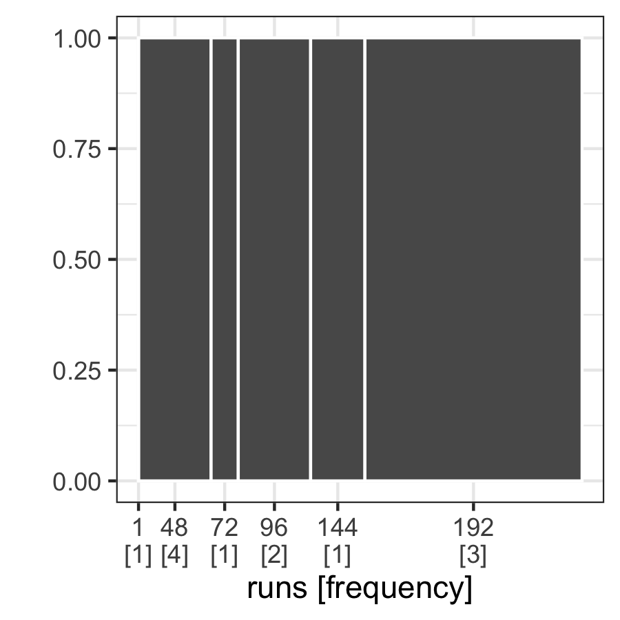
Figure 4.15: The gasp plot for missings at Spencer St-Collins St (South), with six disjoint runs coupled with the frequencies of one to four.
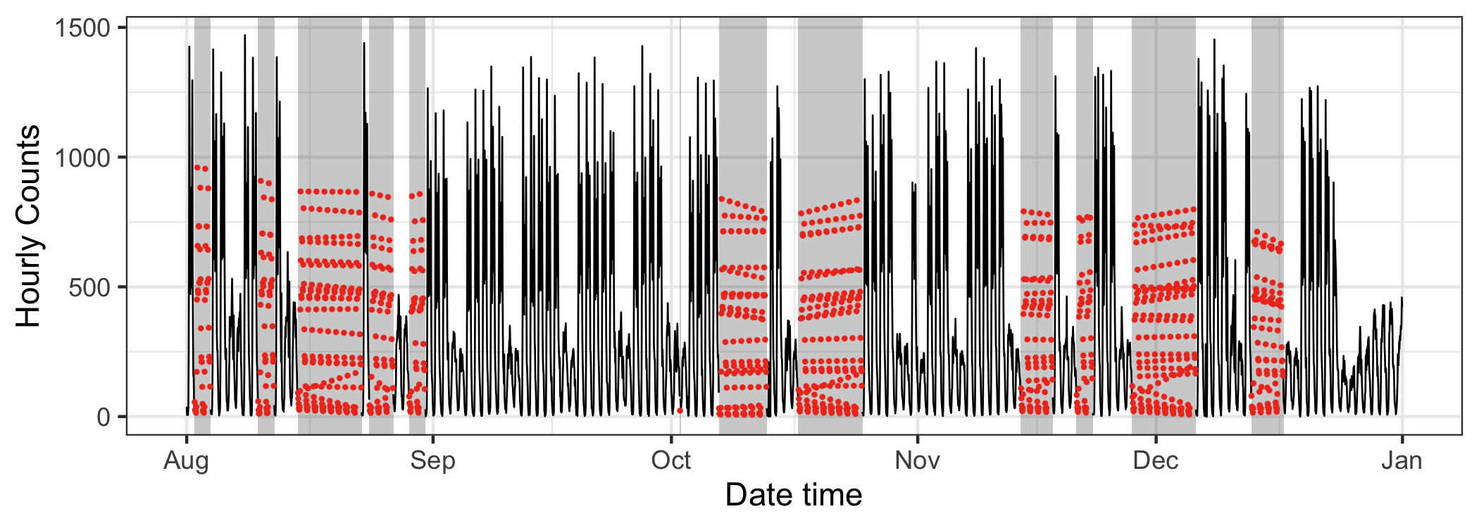
Figure 4.16: The jailbird with colored imputed data using the seasonal split method for the sensor at Spencer Street from 2016 August to December. Strong seasonal features are prominent in the original data, but it is hard to detect the seasonal pattern from the imputed data.
In contrast to the WDI data, the pedestrian data features multiple seasonal components: time of day, day of week, and different types of days like public holidays. Seasonal patterns corresponding to these temporal elements can be seen. The jailbird plot in Figure 4.16, overlays imputed values (red), computed using the seasonal split method available in the imputeTS package. They appear to fall in the reasonable range, but do not seem to have captured the seasonality. Mostly what can be observed in the long time series is work day vs not seasonality. Figure 4.17 drills down into the finer daily seasonality. It splits the series into work and non-work days, colored by imputed or not. The imputation actually does well to capture the daily patterns, at least for working days, It fails on non-working days because it estimates a commuter pattern. This imputation method does not perform well with the multiple seasonality.
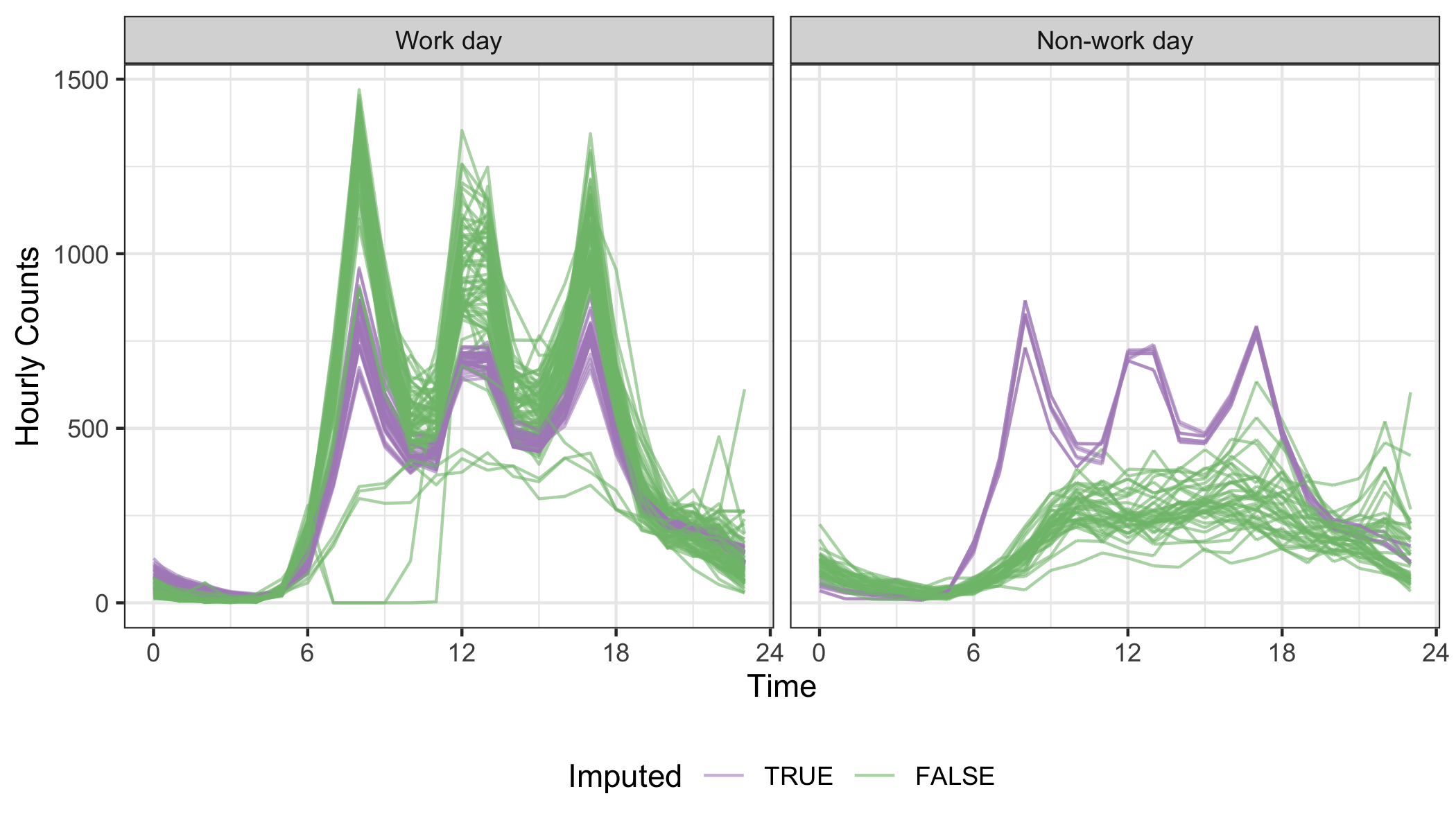
Figure 4.17: Examining the daily seasonality, relative to the work day vs not components, using faceted line plots. The imputation (purple) grasps the key moments (morning and afternoon commutes, and lunch break) in a work day, but is unable to build the non-work profile.